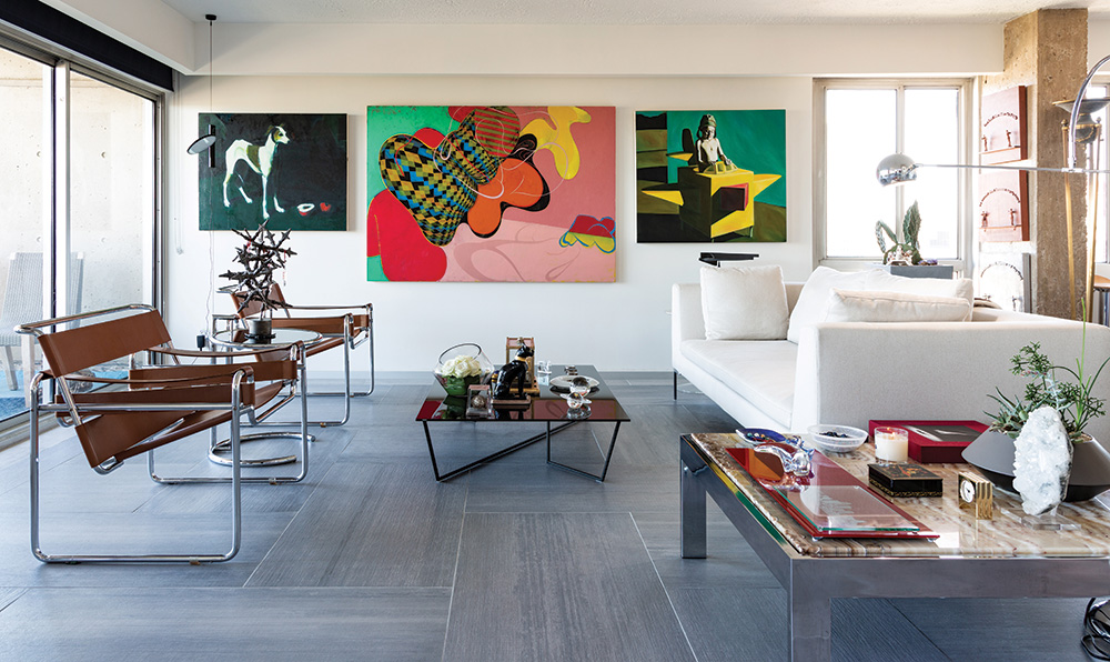
‘‘It was all about the view,” says designer E. Michael Sandridge of Alejandro Design Studio of his San Francisco Tower condominium. Sandridge had previously lived on the Country Club Plaza but was ready for a change and was seduced by the post-Brutalist architecture of the building.
“The architecture is so raw and unpretentious. Brutalism has an air of intimidation. You can see that this building came a little later. It’s softer,” Sandridge says.
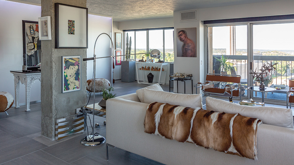
The term “brutalism” is derived from the French “beton brut,” which translates as “raw concrete.” A popular post-World War II style, its construction was relatively inexpensive and easy to manage. As the post-war years were a time of rapid growth, this construction method was popular, particularly for civic and educational buildings.
Sandridge planned to retain both the look and the feel of the raw concrete. “I ripped everything out and started over from scratch,” he said. “I really wanted to polish the concrete floor and leave it. But the building—understandably—has noise-abating requirements, so I had to figure out another way.”
In the public spaces the designer installed concrete floor tiles very much in keeping with the spirit of the building. He also left bare the concrete supports in the interior of the space. Despite the strictness of his structural design, the apartment is not stark. Indeed, it’s rich in details and layers of personal history.
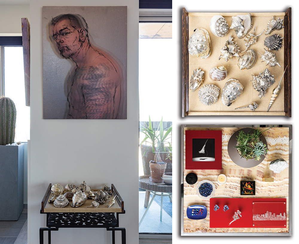
The gleam of the stainless steel of the pair of Marcel Breuer’s Wassily chairs and the Eileen Grey end table add to the view of the Liberty Memorial from the west side of the apartment. Low tables hold collections of paper weights, small sculptures and countless talismans that Sandridge has picked up on his travels.
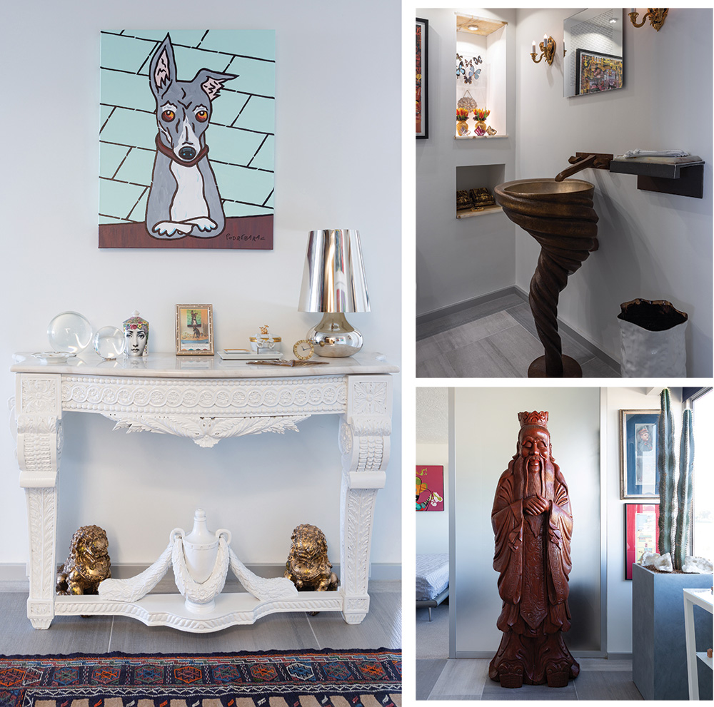
“It’s easier to carry home small things like this rather than art,” he said. “Art I mostly buy at home.”
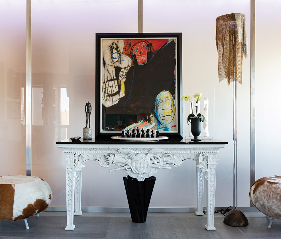
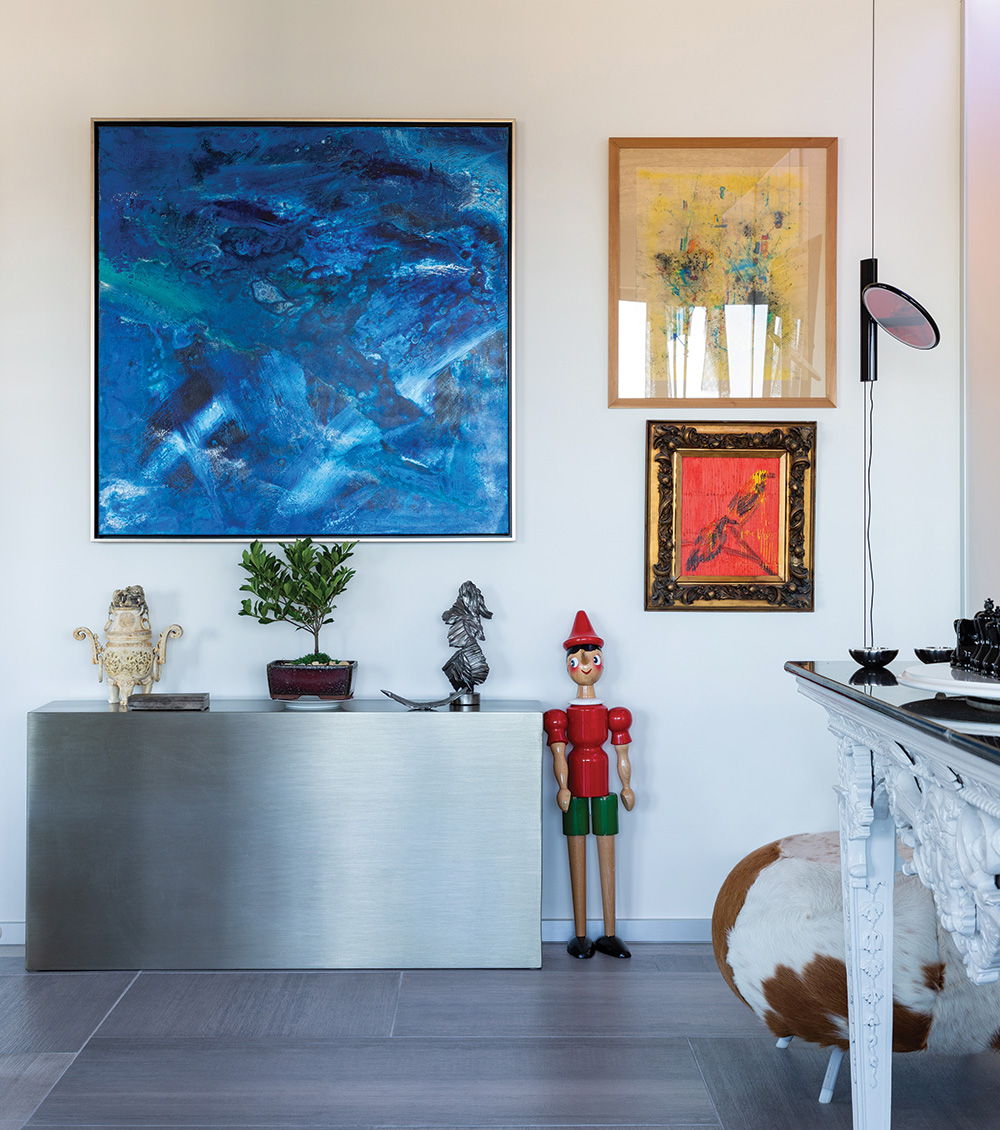
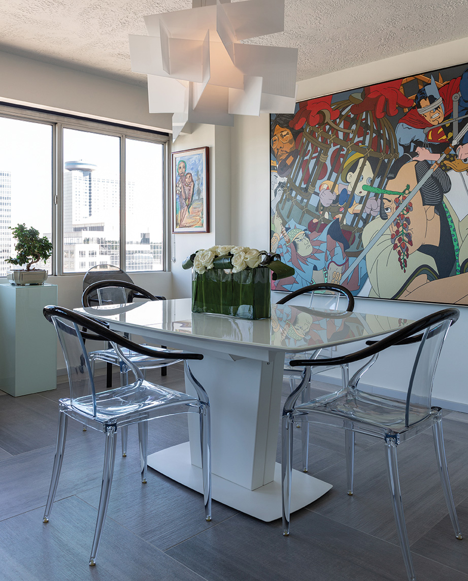
Buying art in town has certainly not proven a challenge. Every wall is a gallery of original art from portraits to abstracts to collage.
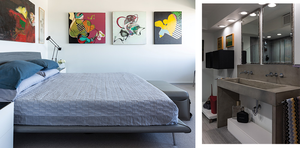
The master bedroom is the most spare—though not stark—room in the home. Here, low, dense carpeting provides a subtle note of softness and comfort. The cloud-like white-to-gray palette provides a haven at the end of the day. The master bath repeats the use of concrete in the custom double sink. To offset its sculptural starkness, Sandridge designed the industrial-luxe riveted stainless mirrors above.
A sitting room at the other end of the apartment holds a sofa bed with a guest bathroom to accommodate family and out of town friends.
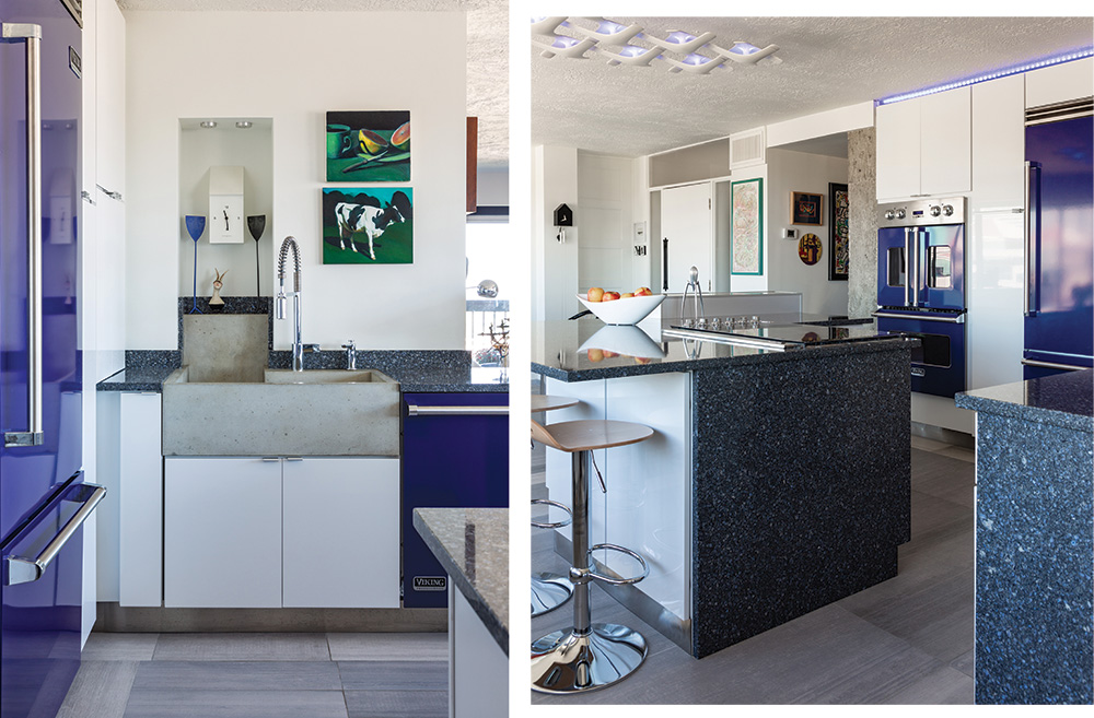
The kitchen is—literally—the center of the home. Its open construction and wrap-around counter make it an easy spot to immediately relax. The counter provides plenty of space to grab a quick bite or linger with guests while cocktails or dinner are in process. Cobalt blue Viking appliances provide an unexpected, but typically “Sandridge,” injection of color in what would have remained for some an entirely neutral space. The deep custom sink and industrial faucet provide another nod to the building’s origins.
As part of Donald Hall’s vision for the development of Crown Center, the San Francisco Towers is one of the tallest buildings in Kansas City. This height and placement provide the kitchen with a perfectly framed view of newly re-lit Western Auto sign.
“We got to see them test it!” says Sandridge of he and his partner. “It flickered on and then went off. We almost couldn’t believe it.”
This unexpected, but magical moment should be expected here. In a home with a custom copper sink in the powder room and a Sicilian shrine amongst midcentury-modern treasures, turning every corner is a delight. Sandridge agrees that his itch to move paid off.
“It was a perfect time to move downtown,” says Sandridge. “The energy is here. It’s a great time to be in this part of the city.”
The It List
Art: Weinberger Fine Art
Custom Concrete: Stogs Concrete Design
Flowers: Studio Dan Meiners
Interior Design: Alejandro Design Studio


