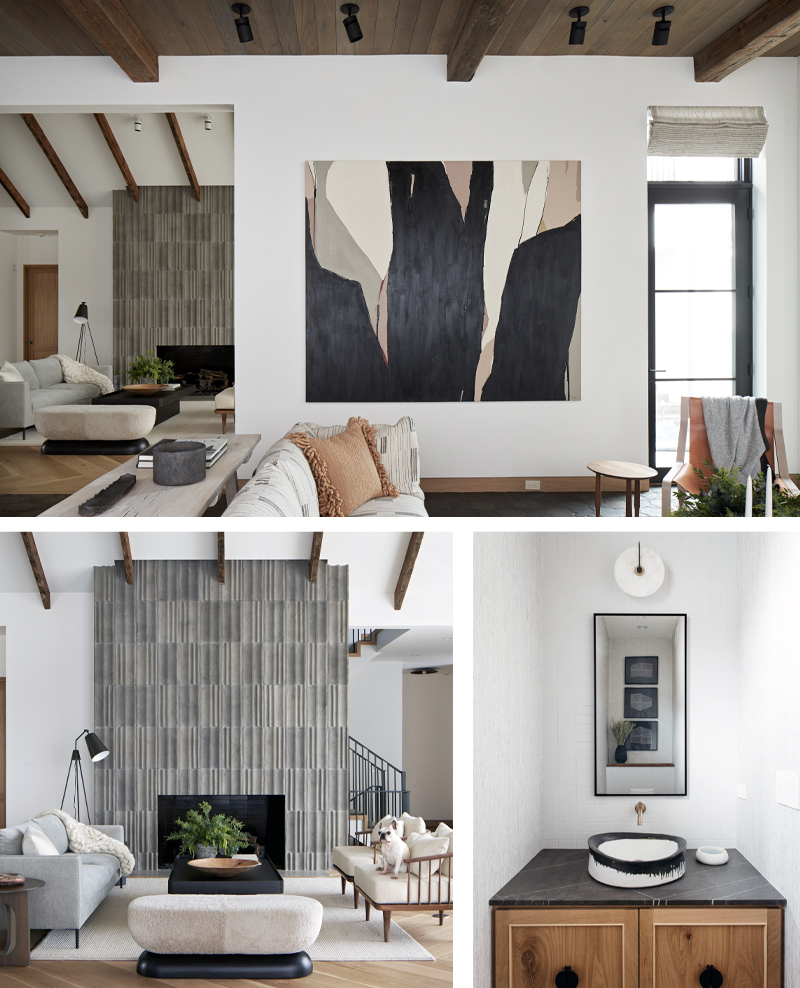
When clients with discerning taste and a penchant for comfort and simple elegance approached Lisa Schmitz, the Kansas City-based designer whose modern aesthetic leans more toward warm than cool, she had just the solution for their house which would be easy, chic, and functional—oh yes, and beautiful.
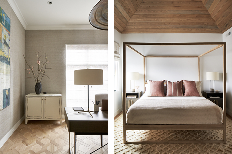
The couple, empty nesters who wanted a home they could love as well as “lock and leave,” were committed to creating a space that was warm and elegant, but not fussy. Schmitz envisioned a solution with natural materials, a refined air and a strong line, but the process was collaborative from the start. “It was the clients’ idea to use reclaimed wood in the beams,” Schmitz says of the recurring element that provides a rustic simplicity and texture to the home. The only other trim in the public rooms is the white-oak baseboards, which are flush with the walls, providing a stripped-down elegance, enhanced by exacting detail.
The beams accent the vaulted ceiling of the living room and intersect with the commanding fireplace surround of Italian terra-cotta tile that captures the spirit of the very best of the Brutalists, engaging the eye while the furniture provides a simply elegant place to rest. “They wanted a modern, simplified detailing that provided texture but didn’t shout,” Schmitz says.
White-oak flooring is a common thread used throughout the home, though the application is modified to suit each space. The floors in the living room are laid in a large herringbone pattern, the variations in the wood as organically varied as the hues in a sand dune. Two chairs from local furniture maker Matt Castilleja are happily at home here with their low, sexy, updated-Windsor profile.
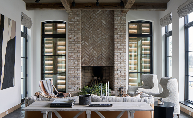
In the sunroom, Venetian plaster walls, steel-framed windows and Belgian star tile provide a crisp backdrop to a modern interpretation of wing chairs clad in a Chanel-worthy boucle. An organic, yet graphic painting by artist Holly Addi, a Utah-based artist, creates its own landscape. “This space that was originally conceived as a porch,” Schmitz says, “But the couple decided more living space was more important, so we shifted.”
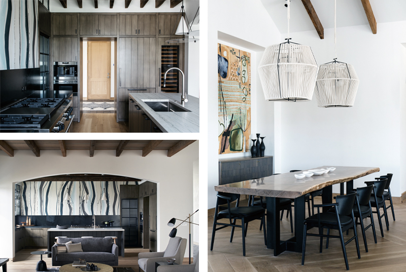
The kitchen, which is visible from the main room, is a symphony of form meeting function. The show-stopping Porter Teleo wallpaper creates its own artistic drama, while black steel provides a crisp edge to the door that conceals the pantry behind ribbed glass, and the shelves that hold glassware and dishes. While most of the appliances are subtly integrated into the cabinetry, the industrial range is the exception. In keeping with the clean design, the range’s ventilation fan slides down behind the cooktop and the wood beams hide task lighting. Nearby, the dining room with its large raw-edge dining table is ready to accommodate friends and family.
The primary bedroom is a serene, monochromatic cocoon, fitting of this luxury escape. Grasscloth wallpaper helps buffer any exterior noise, while the raffia nightstands and wool rug provide additional texture. The lines of the iron bed have subtle undulations that make it appear that it was molded by hand. The same type of variation repeats in the stripe of the bed’s pillows.
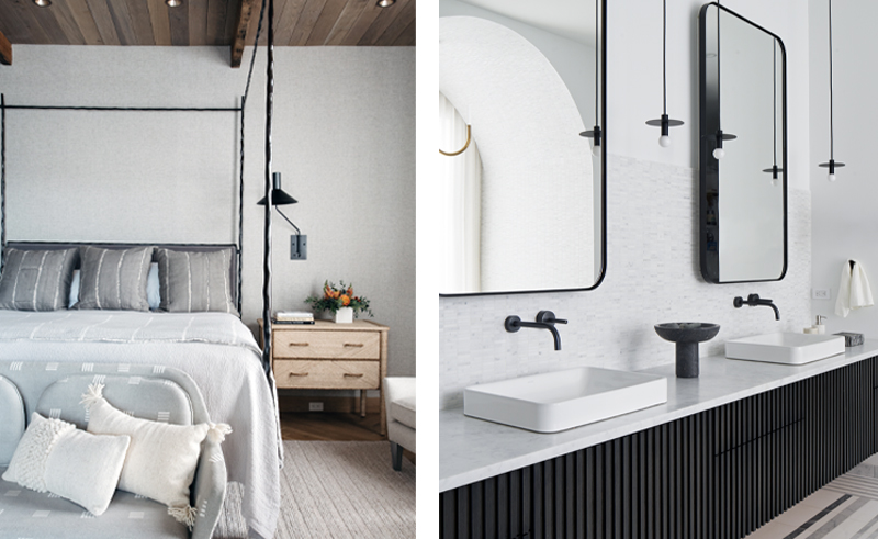
As is not unusual for this house, the primary bath riffs on the room before it. Meticulously paneled hardware-free cabinets hide the boxes, bottles, and jars of life, while large steel-framed mirrors reflect light from the nearby window, and likely the happy faces of their owners.
The It List
Artwork
Haw Contemporary
Furniture
Matt Castilleja
Interior Design
Lisa Schmitz Interior Design
Textiles
Chanee Vijay


