After looking and looking for a home their new family could all share, “As soon as I walked in the door, I knew this is it,” says Katie Lumma. In 2019, she married Dan Lumma, a senior vice president with Kiewit Corporation. The two have a blended family of six children, ranging in age from 13 to 24. No wonder Katie’s role as household manager is now her primary one.
When they first married, they had lived in Dan’s home in the Brookside area with a midcentury-modern-meets-rustic vibe, but the couple wanted a house together that would not only blend their families but also their tastes.
Says Katie, “I love blue and white, a more traditional style, light and airy.”
Counters Dan, “I prefer contemporary design, maybe a moodier palette.”
What was a couple to do?
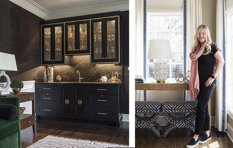
“The smartest thing we did was involve Maureen Lindstrom of ML Designs right from the beginning,” says Dan. “That has made all the difference. She helped us through the whole process of making the house suit us.”
“The bones of the house were gorgeous,” recalls Lindstrom. “It just needed to feel like them. We painted every surface, replaced tile and every light fixture. Because the rooms were so generous, and light flows through the house so well, every room could be its own individual style.”
That pleased both color-loving, traditional Katie, and Dan, who appreciates contemporary lighting and rooms that have a purpose.
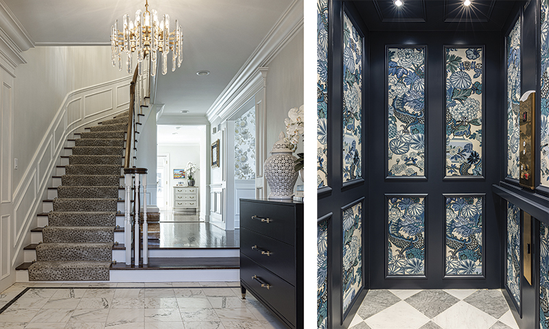
Even traditional elements, such as wallpaper and draperies, go soft and airy or up-tempo. Draperies get unusual trims, wallpapers dance in classic patterns made modern. The home’s elevator is a case in point—Benjamin Moore’s Hale Navy on the wood and an eye-popping Schumacher wallpaper.
“The design is in the details,” says Lindstrom. Three important keys to freshening up an older home are having a cohesive lighting plan, choosing modern hardware, and using patterns with movement and verve, she says. “We wanted to energize the home but keep as many of the elements that had always been there, such as flooring and woodwork, kitchen cabinetry, and the staircase.”
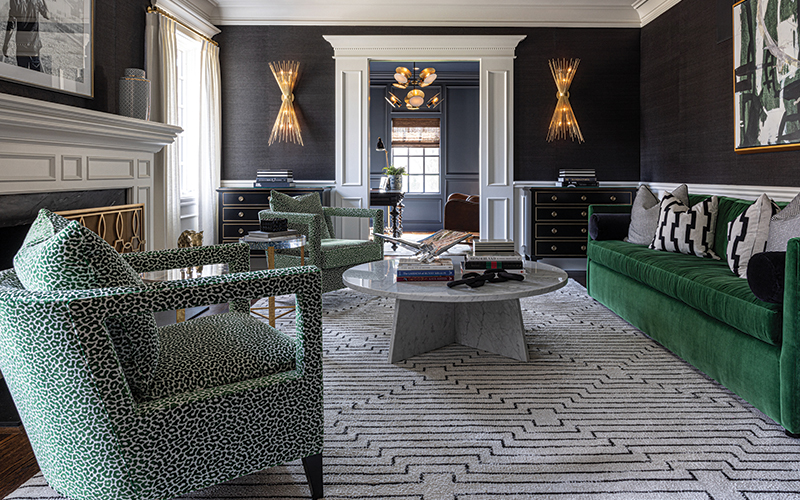
The living room, dramatic in black grasscloth and punctuated with eye-catching golden brass sconces and a chandelier, has a clubby vibe with the addition of a glossy, black-painted bar that features a dramatic soapstone backsplash, perfect for mixing up Dan’s favorite Pendergast cocktail. “It’s stunning,” he says. “I wasn’t sure about the green lizard snakeskin pattern at first,” he admits, “but it’s great. And it’s a luxury to have a dedicated space where you can just unwind.”
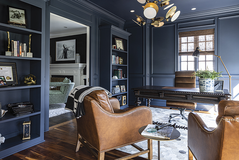
His nearby office in Hale Navy features soft leather chairs the color of a fine cognac.
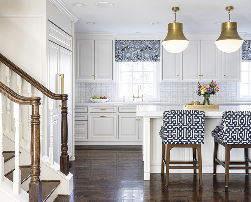
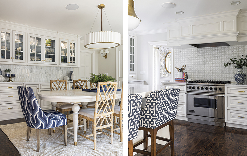
Katie’s favorite area is the blue-and-white kitchen and breakfast area. The original cabinets were painted white, the tile replaced—square around the stove and lozenges as a backsplash in the breakfast area. A generous island is surrounded by comfortable, upholstered seating in blue-and-white geometric patterns. “I love to cook and have the kids sit around the island,” she says. “I love this big open space where we can all be together.”
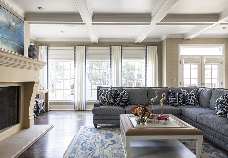
The hearth room is another space where they can all be together on its generously sized sectional sofa.
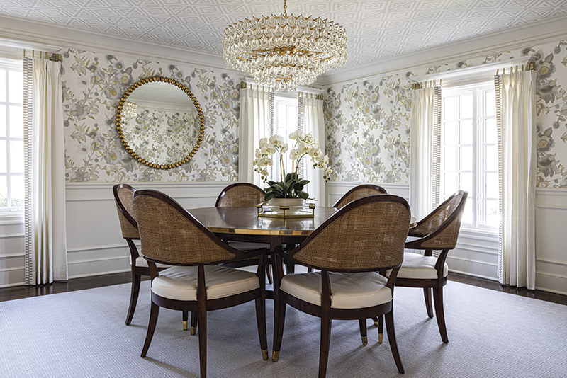
Across the hall, the dining room is a contrast in a softer, airy taupe and gray floral with a traditional round table and curved, caned chairs the Lindstrom team found at market. “We knew at once they were perfect for Dan and Katie,” says Lindstrom. The teardrop crystal chandelier adds sparkle in the evenings, reflecting on the golden brass trim around the table.
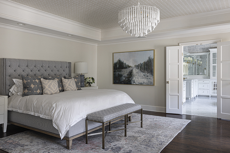
Upstairs, the primary bedroom and bath is a study in sophisticated comfort—soft blues, marble, and quiet pattern, as suits the adults in charge of a large brood. A large, tufted blue ottoman near the sculptural soaking tub allows a bit of practical softness in a room full of hard surfaces, says Lindstrom. “When the light comes in the windows, it makes everything sparkle,” she says.
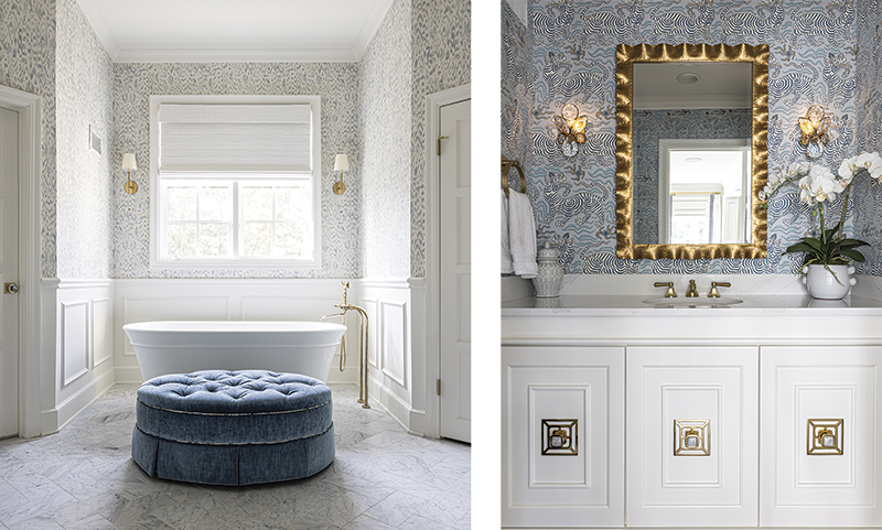
Like all talented designers, Lindstrom and her team pushed the couple out of their comfort zone in the nicest possible way. Not just a little. A lot. “We were pushed in every room,” Dan says with a laugh. “I wasn’t sure about that zebra wallpaper in the small bathroom, but it all works.”
“We were so lucky to work with Dan and Katie, who have such great style and let us run with the project,” says Lindstrom.
“We were really trusting,” agrees Dan. “The end product is so much better than we could ever have imagined.”
The It List
Interior Design
ML Designs
Builder
Hurst Construction, Inc.
Lighting
Relative Lighting
Paint
Super Sweet Painting


