Refresh and Rewind
Hard-working appliances, classic materials, and touches of color inject new life into a dated kitchen.
Colby and Megan Garrelts, chef-owners of Bluestem in Kansas City and Rye on the Plaza and in Leawood, are on speed-dial with the James Beard Award Foundation. Colby won Best Chef Midwest, Megan was a semifinalist for Best Pastry Chef, and Bluestem has been a three-time nominee for Outstanding Restaurant.
But at home in Leawood, they had a dated, dysfunctional kitchen. Recently, they used their professional experience to design a new space where they can cook, bake, kick back with their two kids, and entertain. “We wanted our kitchen to feel like an effective place to work and a fun place to be,” says Megan. They called on Scovell Remodeling to transform the plan into reality.
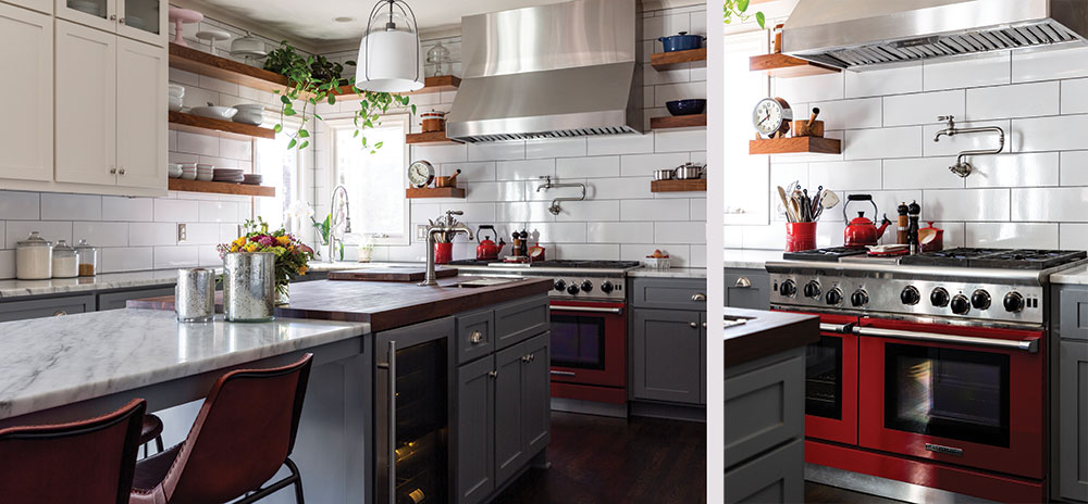
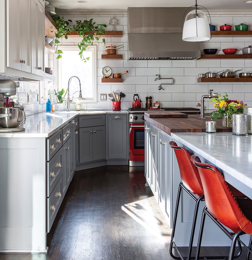
Each had a wish list. Colby wanted a Zephyr commercial-style range hood. He also wanted open shelving to keep their Mauviel pots and Le Creuset cookware within easy reach. Megan wanted “my own oven” so that Colby’s roasting chicken didn’t comingle with her chocolate chip cookies. They both won with a commercial-quality 48-inch American Range in a red that reminds Megan of picking cherries and making pies as a child.
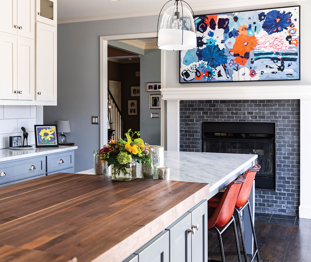
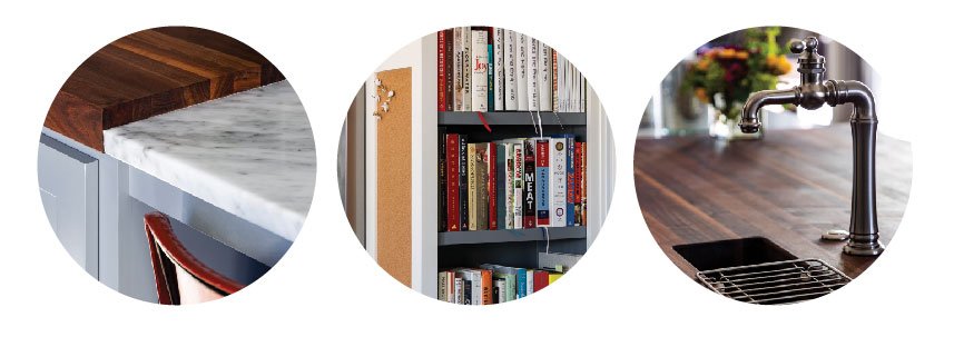
Books needed to be on proud display. “Having a kitchen library is important to us,” says Megan. She and Colby are also the authors of Bluestem: The Cookbook and Made in America: A Modern Collection of Classic Recipes. A custom painting by local artist Kelly Porter pops against the white and gray cabinetry.
“We wanted natural materials for our countertops,” says Megan. “Marble and wood will show wear and tear over the years, and we like that. ” Marble stays cool for rolling out pastry; the huge Boos walnut butcher-block island doubles as work surface and kitchen table—“just like in a restaurant,” says Megan.
When they had to choose, space-wise, between a microwave oven and a wine cooler, there was no contest. “We always go with wine,” she says with a laugh.
Dinner and a Show
A dramatic, hard-working kitchen that makes entertaining a crowd applause-worthy.
Alan Gaylin, founder and CEO of Bread and Butter Concepts, was spoiled for design influences when he and his wife, Bridget Gram, remodeled their Mission Hills kitchen. White subway tile, retro wooden bar stools, and open shelving like Urban Table or rustic roadhouse, such as found at BRGR in Prairie Village? Vintage Kansas City river town at The Oliver or refined steakhouse at Stock Hill on the Plaza?
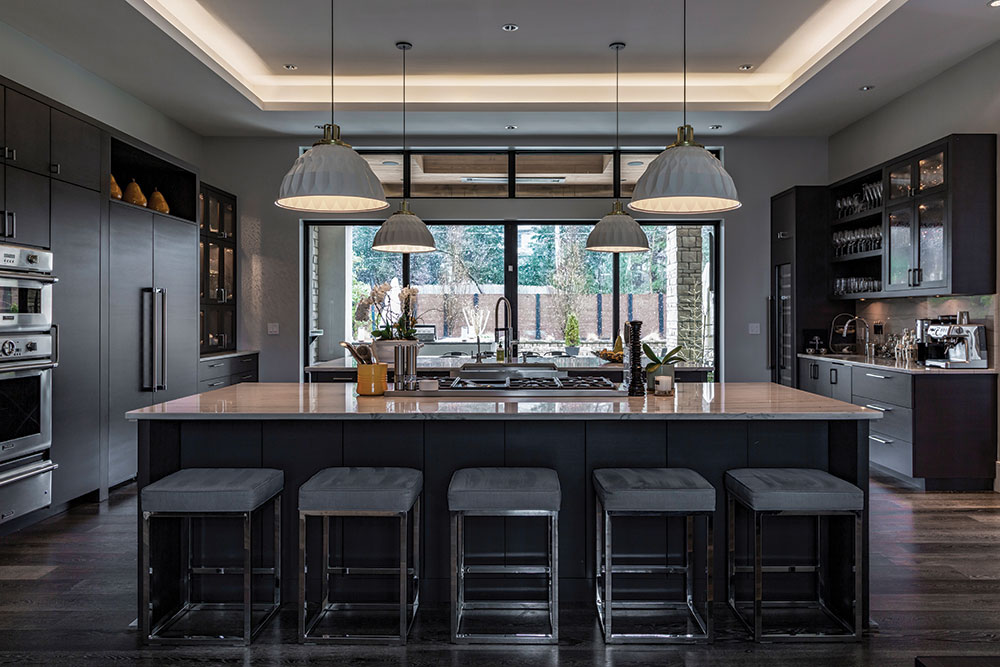
Although Gaylin and his wife used the firm that designed the eight local Bread and Butter Concepts restaurants, Realm Architecture + Design, their kitchen is “more of our own style,” he says. “Our house is more contemporary. We really like to entertain and this room becomes the central meeting and conversing area. Between the indoor and outdoor kitchen, we can easily accommodate 60 people. ”
Every successful restaurateur knows that cooking is theater, and theater is where people want to see and be seen.
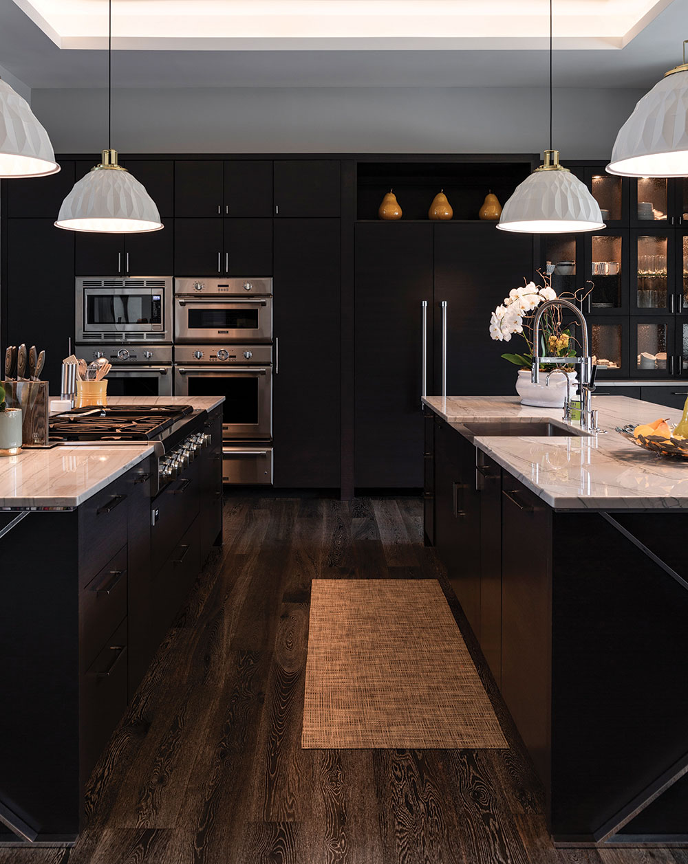
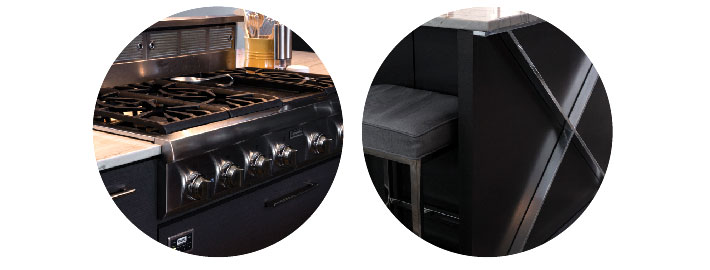
The couple set the stage where their lucky guests can get front-row seats. The open space is dominated by two parallel 12-foot by 6-foot islands topped with big slabs of veined quartzite. Smoky blue velvet-covered bar stools line the outer perimeters. A prep sink and a large gas Thermador cooktop on the inner perimeter allow the culinary drama to unfold as guests watch. A Viking downdraft exhaust system assures that every seat has a good view.
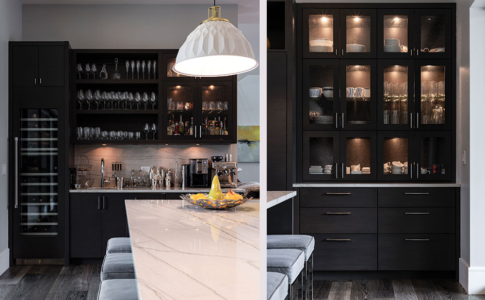
A wall of custom cabinetry deep-stained a smoky taupe holds the two wall ovens, warming drawers, steamer, and refrigerator. On the opposite side of the room, another wall of cabinetry defines the bar area with open shelving, another restaurant design carryover. “You know why your eye is always drawn to the bar in restaurant?” Gaylin asks. “Because you get to look at all the bottles. ”
“The coolest part of our kitchen is the sliding glass doors that open up to an outdoor patio with a pizza oven and an outdoor kitchen,” says Gaylin.
“Maybe the style of our kitchen is a little Stock Hill, a little Gram and Dunn,” he reflects. No, wait. Stock Hill opened before this kitchen was finished. He laughs. “Maybe Stock Hill has some of our kitchen in it. ”
