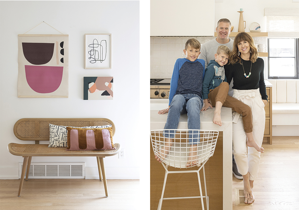
As soon as you walk into the Georgie household, you can sense it.
This house feels happy.
“I believe that creating a home that is peaceful and relaxing is truly a form of self-care,” says Morgan Georgie, co-owner with Carrie Kiefer of Ampersand Design Studio. “We can’t control the world around us but we can control the way our homes make us feel.”
Morgan and her husband, Dan, who is in medical sales, live in this renovated Fairway ranch with their two young sons Lennon and Shaw, and Greta, part German shepherd, part Great Pyrenees. They waited eight years before deciding on a remodel that would “build the life that we want,” Morgan says.
To do that, they gathered a group of special people. Morgan’s architect father, Craig Shaw, devised a plan that took space from an unused front porch to make the kitchen area larger and allow for a central island. Dan’s friend Brian Hartis handled the construction.
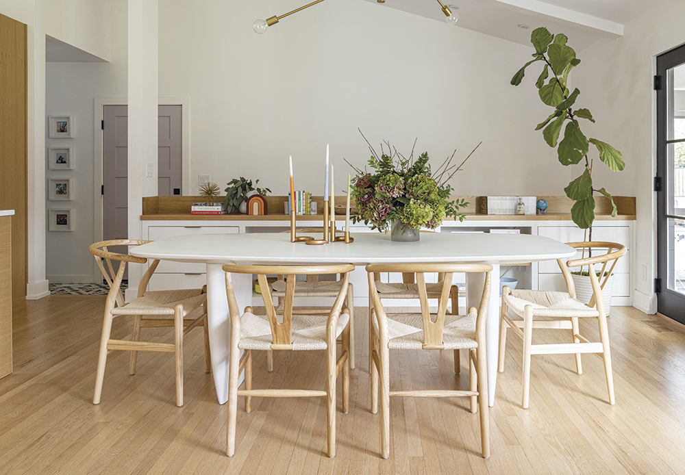
And Morgan’s friend Molly Jarvis of Brasstacks Design + Build helped reimagine the main living space. “Morgan and I met when we did a workshop with Anthropologie,” says Jarvis. “We wanted the living space to be thoughtful but neutral to let her art tell the story.”
The story begins with a pale palette of warm white walls and rift-sawn white oak cabinetry with a linear grain. “We tried five different whites on the wall to get a shade that was light, but not cold,” says Morgan. Benjamin Moore’s “Chantilly Lace” won out.
The open-plan main living space allows the boys to run around and their parents to keep an eye on them. Light pours in. “Letting the sunlight in has so many health benefits, but it’s also the only way to keep our growing collection of indoor plants alive and happy,” says Morgan.
And there is a marked absence of stuff.
“One major goal for the kitchen and living room was to reduce clutter,” Morgan explains. “I wanted the choice to keep the countertops as clear as possible. Opening up walls and vaulting the ceilings helped the space feel more open, but adding additional spaces for storage was the real key. Our kitchen countertops tend to be where our daily clutter lands. So, as we opened up the kitchen and gained drawer space, our family sort of assigned not one, but four ‘junk drawers.’ We have one that holds the kids’ arts and crafts supplies that we use almost daily, another for mail and schoolwork, then two for the usual pens, keys, small tools, wallets, you name it.”
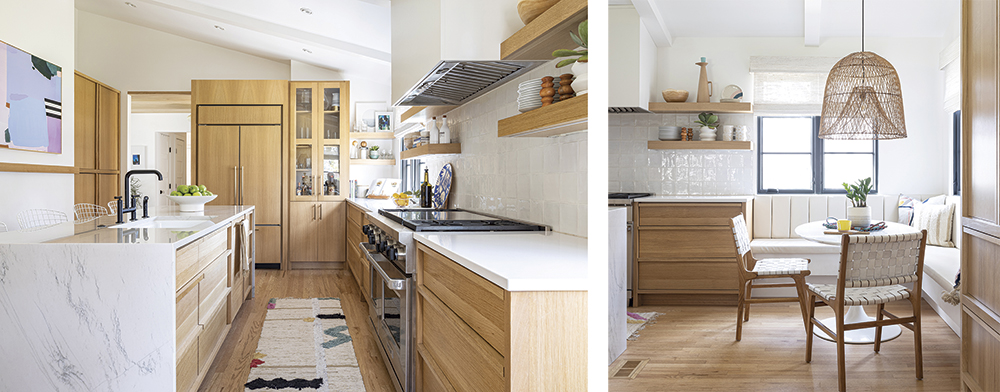
The family also had small appliances—coffee maker, milk frother, electric tea kettle, a blender for smoothies—they wanted hidden when not in use. A tall cabinet with sliding doors now conceals them all.
The breakfast nook with a banquette covered in a child-friendly fabric “is where we live,” says Morgan. It’s where the boys come in with their blankets for an early morning snuggle, where meals are eaten, where birthdays are celebrated.
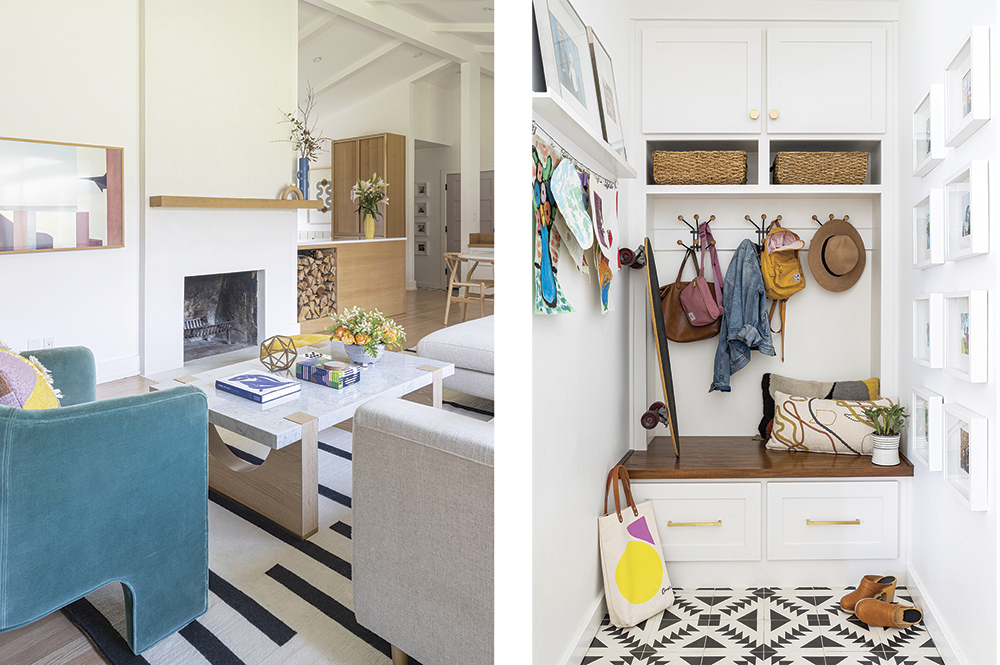
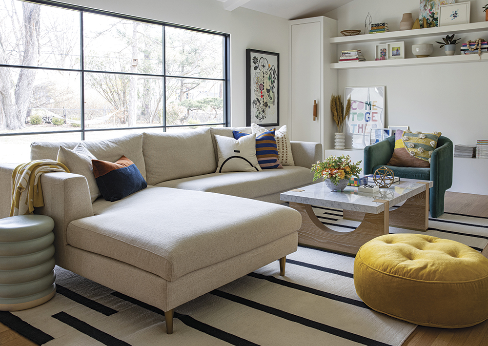
In the living room, a fireplace provides a cozy spot on cold days, but the wide view to the treehouse and zipline in the backyard promises fun. A tall cabinet on a far wall hides games and toys. Morgan’s “Come Together” graphic print adds a pop of color.
The master bedroom is pale, neutral, organic. “I work with color all day, so at night it’s relaxing not to think about it,” she says.
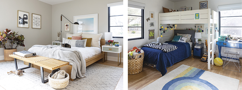
In the boys’ room, a rug Ampersand designed for Land of Nod (now Crate & Kids) and Ampersand bedding make it fun. In the hallway, a gallery of the kids’ art brings a smile.
On the lower level, the pandemic schoolroom offers a desk for kindergartener Lennon and fourth-grader Shaw, a colorful environment for remote learning.
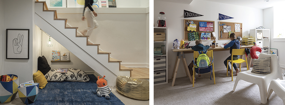
“We hoped to create a bright, happy space that’s calming and inviting,” says Morgan.
And they definitely did.
The It List
Architect
Shaw Hofstra + Associates
Construction
Hartis Construction LLC
Flowers
Bergamot & Ivy
Interior Design
Brasstacks Design + Build


