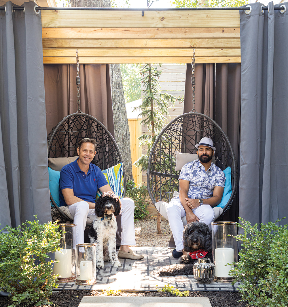
Seven years ago, Kansas City designer Doug Wells bought a nifty raised-ranch house in Fairway Manor to use as his office and a home for his mother, who was downsizing. Four years later Wells and his husband, Marcio Reis, were considering selling the house and buying a condo for his mother to simplify all their lives. Then Reis—who is also a designer—suggested she move in with them.
“Marcio is from Brazil and their culture is all about family,” Wells says. “He thought the natural solution was for my mom to live with us. We don’t really do that in the U.S.,” Wells deadpans. After a family conference they settled on the idea of one home with a mother-in-law suite.
They considered searching for a new home and then realized that with some modifications the “office” property would be a smart set-up for all of them. Wells, who trained as an interior architect, went to work reimagining the space.
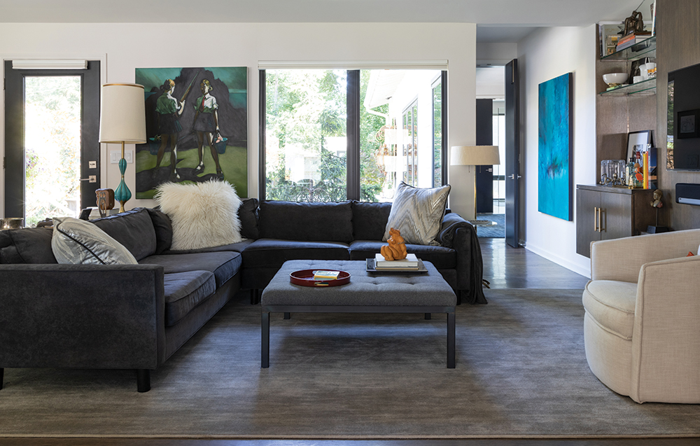
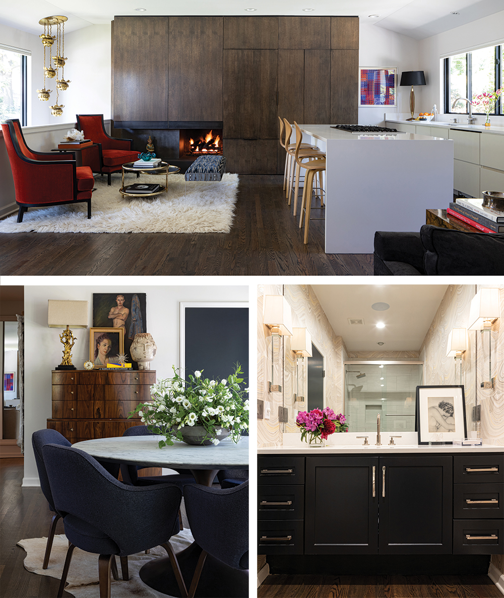
“For my mom’s apartment we converted two bedrooms into the new kitchen/living room area and added an addition to accommodate a new bedroom and laundry,” Wells says.
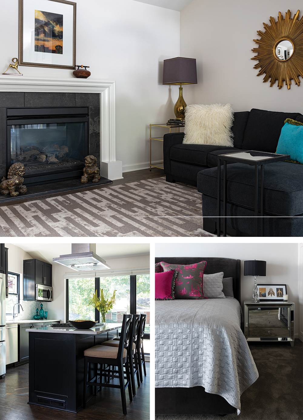
While he makes it sound simple, the infrastructure supporting the plan is more complicated and very well thought out. Well’s mother is healthy and still working, but they took a long-term approach to the project. The garage, which was under the original bedrooms, was expanded and an elevator was added to ensure that access would always be easy and provides his mother her own entrance. Then Wells essentially moved the components of his existing kitchen to her section of the house. Now it opens to a chic—yet cozy—living area with a fireplace and television.
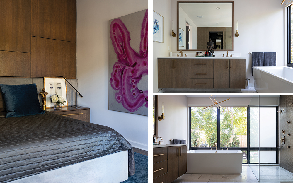
Her bedroom and bath suite feels as luxurious as a high-end hotel. The gray and white palette is both soothing and sophisticated with the silvery gleam of the fixtures providing just the right amount of sparkle. High glam mirrored bedside tables and pink chinoiserie pillows provide a feminine touch. This is not a boys’ club after all.
That said, Wells did take special care to make sure the entire house received the same level of attention. He raised the roofline to provide high ceilings in the living and dining areas of the main portion of the house. The new built-in cabinetry in the kitchen reads more “paneling” than cabinets. It’s here that the men’s combined aesthetic is announced, though it whispers more than shouts. The rooms are modern, but there is a conscious blend of rich texture and natural materials that keep them warm and approachable.
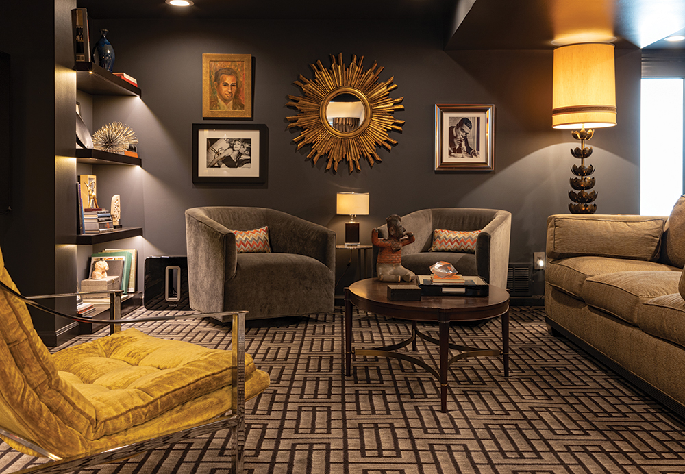
Wells took advantage of every inch of the property. Between work and travel—they are recently back from Argentina as well as Brazil, where they are remodeling their second home— the men don’t have a lot of time to loaf, but the basement with its dark walls and deep seating is the perfect spot to relax and watch a movie or enjoy cocktails with friends.
The couple added a new master suite that is a soothing oasis of off-white, warm wood, bronze and ocean blue. A smartly designed closet gives both men ample space and the bath is flooded in natural light.
The room overlooks a newly reimagined backyard. Wells wanted the property to have two distinct, private areas—one for his mother and one for the couple.
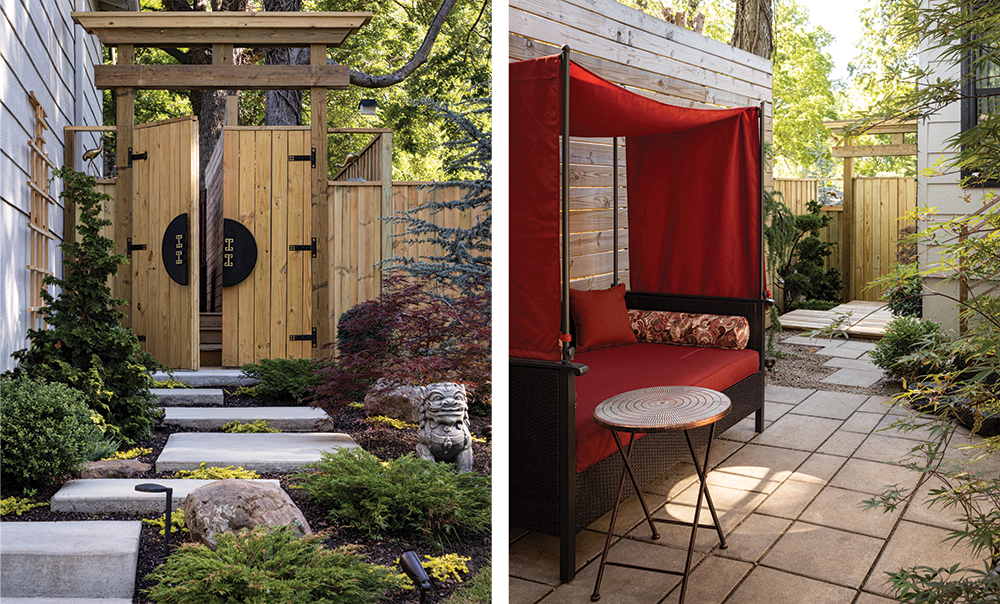
“We really wanted my mother’s space to feel like a Japanese garden,” Wells says.
The wood walkways, sculptural plantings and stone patio create a soothing energy.
Wells and Reis’s garden is a more modern space blending their aesthetics.
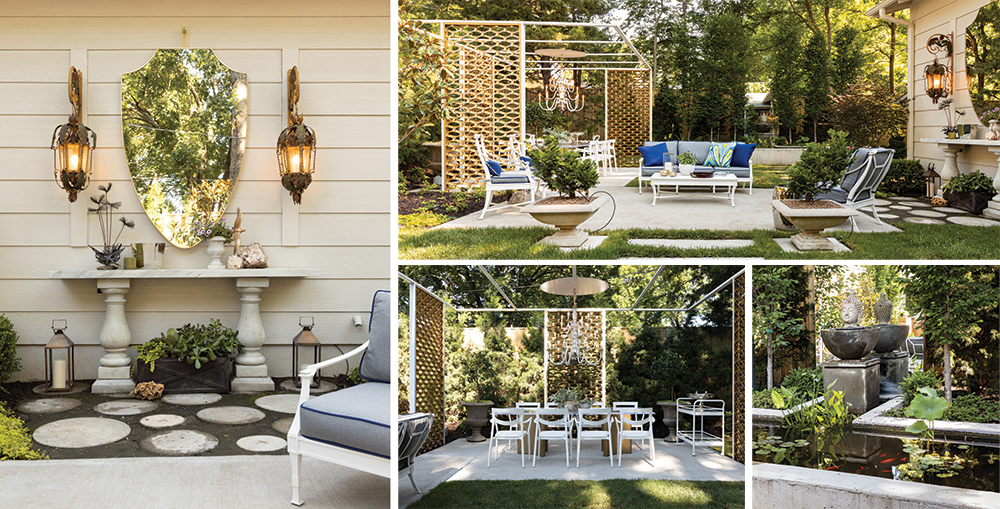
“Brazilian culture is all about friends, family entertaining, and the outdoors, so we decided to make our yard more like outdoor rooms,” Wells says. “We just finished up this dining area.”
The chic garden pavilion is framed by vintage screens that Wells unearthed in a local salvage shop. The Lucite table and the chandelier make outdoor entertaining as comfortable as inside. A raised pond replete with lily pads reflects in the dramatic mirror that is installed at the rear of the garden.
Ah, yes, but what about the office? Ever resourceful, Wells reimagined a former free-standing storage shed. A large mirror on the back wall reflects the light and visually doubles the space.
“It’s great,” Wells says of this private room complete with conference table. “It’s so easy to meet clients out here and the light’s amazing.”
While this multi-generational, multipurpose dwelling was not the original intent, its evolution seems like kismet.
“I’d rather spend more money on a smaller space and focus on quality over quantity,” Wells says. “It’s so much more personal.”
The It List
Flowers
Bergamot & Ivy Design
Interior Design
Wells Design Studio


