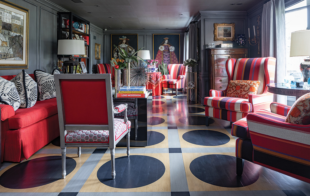
Tucked away on a quiet street in Fairway, interior designer Daniel Houk and his loyal and stylish client have created the perfect home in what some might consider a sort of “mulligan.” His client had moved just four years ago but she decided she needed to move again. “It was a lovely neighborhood,” she says. “But it turned out to be not quite right for my dog and me.”
Houk, the director of interior design with Trapp and Company, has been her designer since he decorated her first house early in his career. They have the understanding, good humor, and sensibility of old friends. It isn’t unusual that they finish one another’s sentences. By all accounts, it seems as if they are usually on the same page. “I loved this house the first time I saw it,” she says. “It’s a little more condensed than my last one and I liked the idea of using the whole space.”
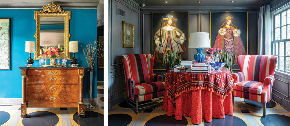
The previous owner had replaced the roof and HVAC, so the client and Houk could focus on backgrounds and furnishings. She had a short wish list for the renovation, including an aversion to fussiness. “I want to be able to sit in any room and have a sandwich or a drink and relax,” she says.
Also, she wanted to be able to use as much of her upholstery as she could without going through the bother of a lot of recovering. This meant the house would have something of a red thread running through it, but one that is lively and bright rather than shouting and loud.
In addition, she had recently inherited some of her mother’s and grandmother’s furniture. She was excited to work these new/old pieces in to honor their remarkable taste and make them her own.
Houk understood immediately her perspective and started to put together a plan. “This is the fifth house that we’ve done together,” he says. “So there is a lot of trust.”
He began by tweaking the floorplan. Originally, the front door emptied into the living room with no separation. Houk and the client agreed that the space should have more structure. A doorway from the entry that frames the living room was added, while a lively and welcoming peacock-blue hue graces the foyer walls.
A graphic gray-and-black geometric painted floor flows from the entry through most of the first floor. Glazed-gray paneled walls provide a chic, subtle backdrop for the client’s art and furnishings that range from antique to modern black lacquer. “She’s very brave with color and texture,” Houk says of the homeowner. “So, we played with the glazing of the squares on the ceiling and the color of the paneling to allow for that.”
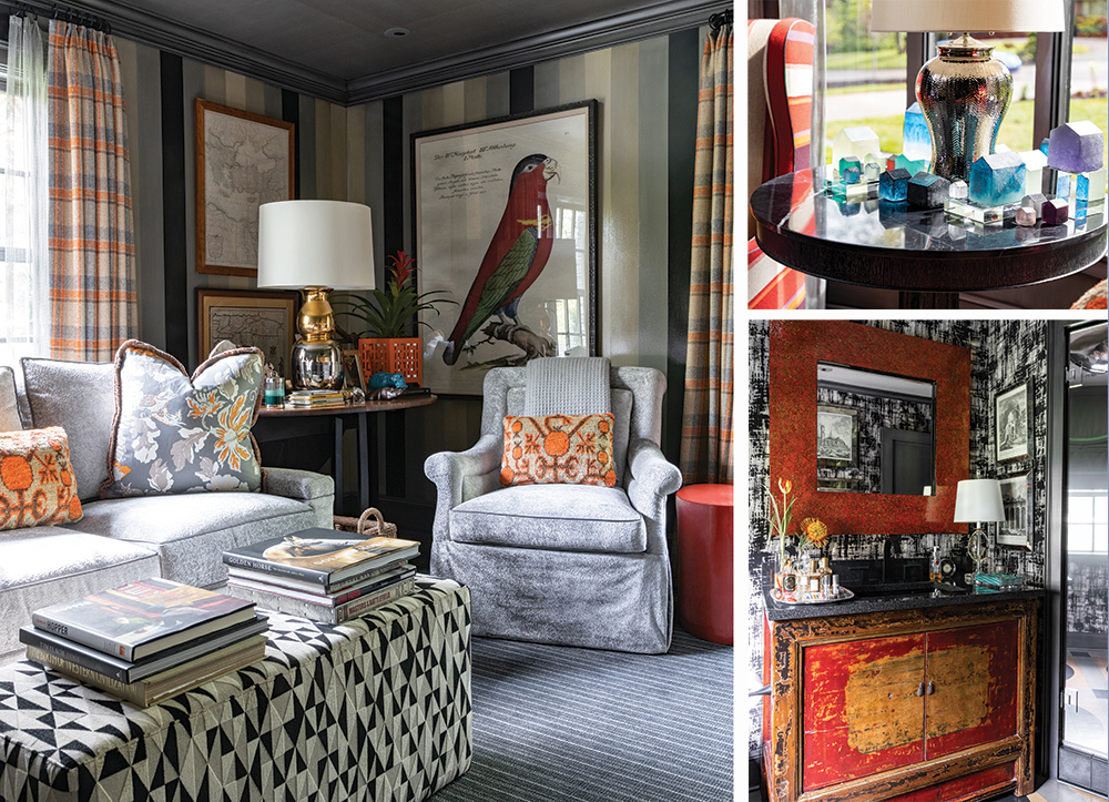
Antique sterling, oil paintings in gilt frames, and a collection of modern Ohgita Katsuya cast-glass houses coexist happily with chrome vases, Clarence House cut-velvet pillows and blue-and-white porcelain.
“And books!” notes the homeowner. “I kept telling Daniel, ‘I need more space for my books.’”
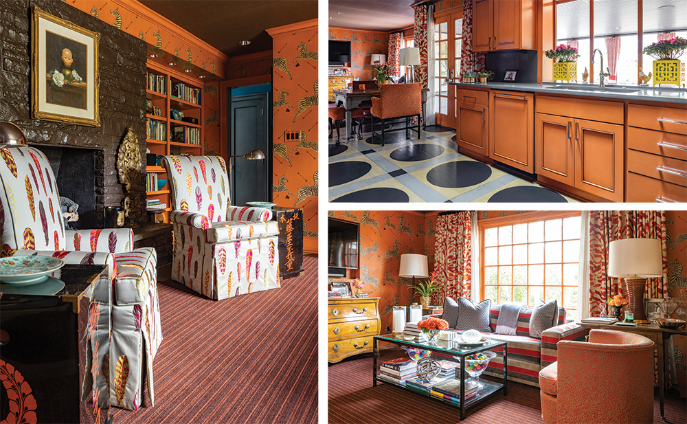
He wholeheartedly agreed, and provided a substantial bookcase in the living room and bookshelves that flank the fireplace in the Hermes-orange den, a room clad with the classic Scalamandre Zebras paper, which adds a shot of spicy chic. This juicy color appears again on the kitchen cabinets providing a zesty dose of cheer morning or night.
The private quarters of the house received the same thoughtful attention. Matouk bedding graces the upholstered bed in the master bedroom. Gray-and-white carpeting, hound’s-tooth Holland and Sherry fabric—reminiscent of Chanel—on the walls, and a green tortoiseshell-papered ceiling create a soothing cocoon. “We really wanted this room to be quiet,” Houk says.
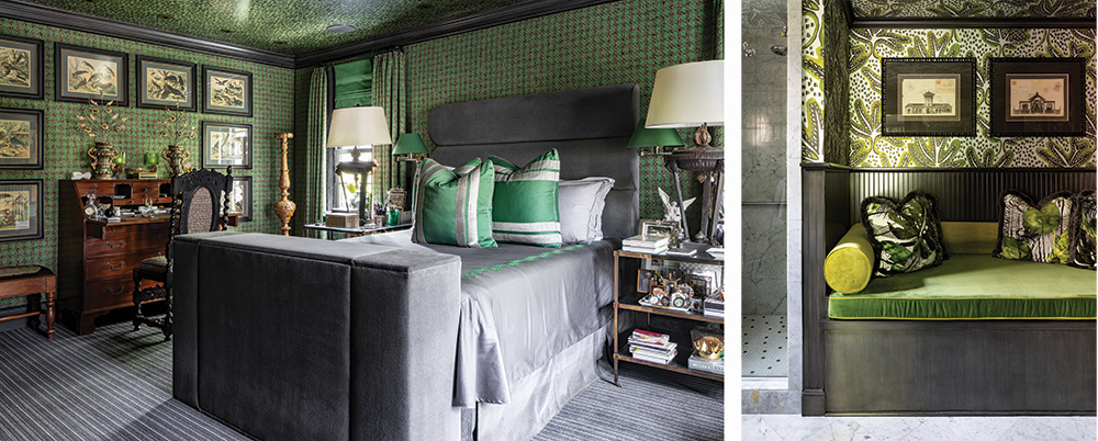
The same careful planning went into the office. A hand-painted, striped glaze adds subtle texture to the walls, while rich, gray wool covers the sofa and hangs at the windows. “This room doubles as the guest room,” Houk says. “The sofa is a sleeper as well and is incredibly comfortable as both.” The graphic and geometric cut-velvet ottoman is the perfect rest for both books and feet, proving that form and function can go happily hand-in-hand.
The guest bath is equally elegant and efficient. Houk used an Asian chest as the vanity, mirrored frames hold architectural prints, and a shower door doubles as a mirror, all effects that say “powder” more than “bath.”
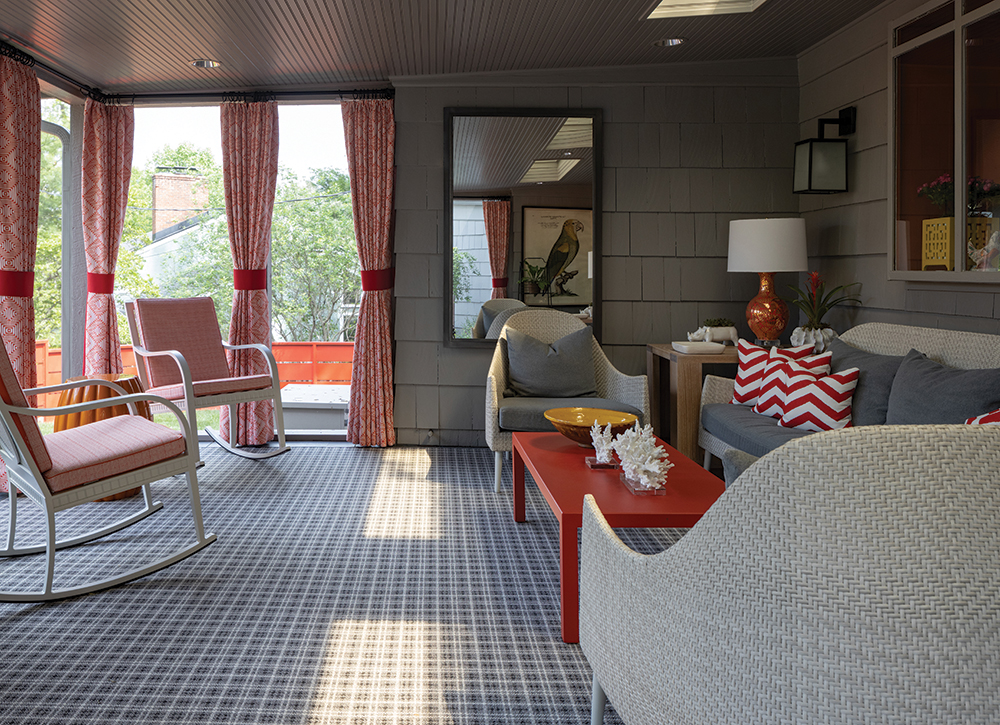
The inside smartly taken care of, Houk and his team—which included Centric Projects, a valued partner on the project—began to look outside. The screened porch is a lovely outdoor room and a perfect spot to read or relax with friends. Just beyond you can see the horizonal panels of the red metal fence—a cheerful “pop” on the outside of the house. “You can’t help but notice the fence,” says the homeowner. “When you see it you think, “This is a happy place.”
The It List
Contractor
Centric Projects
Interior Design and Flowers
Trapp and Company


