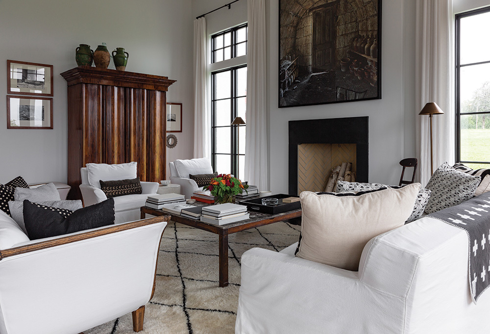
Olathe, Prairie Village, Hyde Park (twice), Sunset Hill, Country Club District, Downtown, Crossroads, Fairway, Roanoke, Kansas City, KS, and now the Westside—all neighborhoods and towns I’ve lived in and around Kansas City. Although I grew up in Iowa, I’m nothing if not local. In every one of those homes, I did some sort of renovation. Sometimes a lot (my husband and I lived in a garage for six months while we renovated the Sunset Hill house); sometimes a little (a coat of paint will do wonders for even the worst room).
All those renovations left me with a taste for something new. As in a new-build. What would it be like to design a house around how we live instead of trying to fit how we live into a house?
So, dear reader, we did.
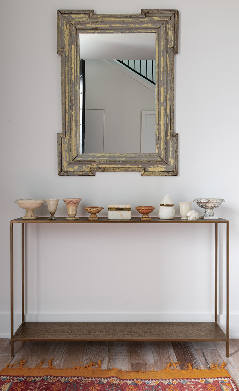
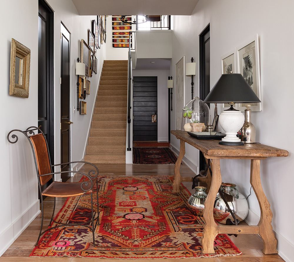
When people ask me what it’s like to design and build a new house, my go-to line is that it’s a lot like giving birth: miserable pain that you happily forget once it’s all over. Now, I have never given birth, but I can verify the painful contractions I felt when the hardwood floor was delivered, and it was not at all what I was expecting when I selected it from a 1-foot by 2-foot sample. It’s grown on me, thankfully.
We started with finding the perfect lot. We both knew we wanted either a view or a wooded lot in our much-loved Roanoke neighborhood. The view won.
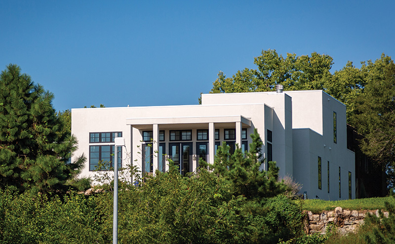
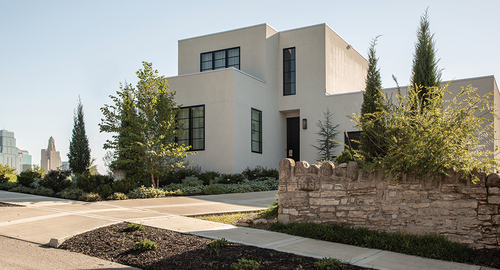
The first thing I learned is that you can’t have everything you want. My dream house in my head has always been U-shaped, with rooms opening onto a central courtyard. Our Westside lot had a fabulous Downtown/Crossroads/Union Station view, but it was a slender 50-feet-wide. So I began sketching a floor plan that would work on our lot, oriented toward the view, and still fit our life. The finished house remarkably could be dropped into that very first rough draft, down to the little side courtyard for our dogs.
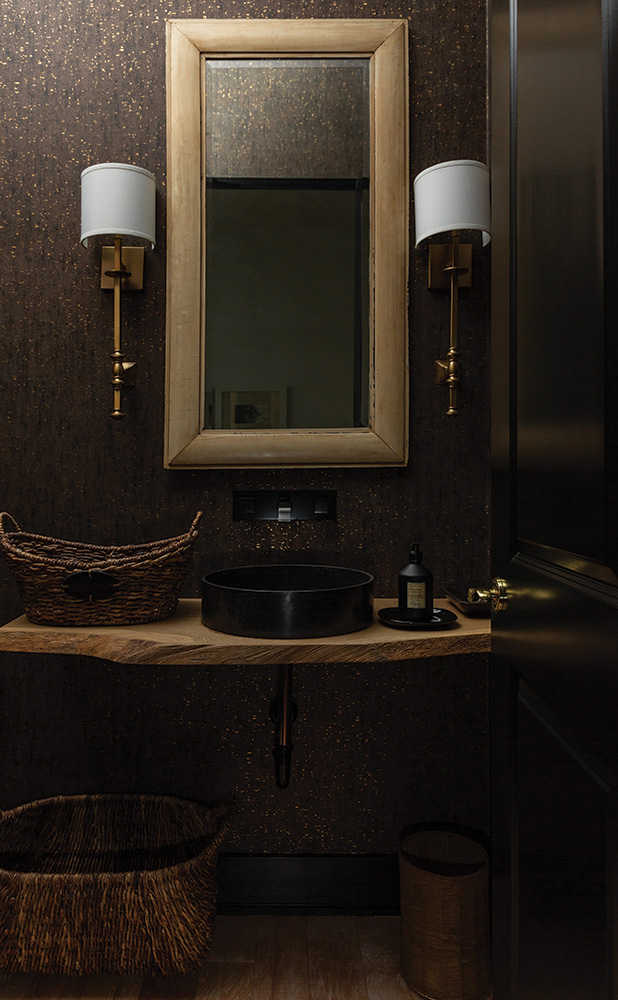
Now I’m no fool; we hired an architect. He’s a long-time friend who was happy (I think) to work with my vision. And when it came to details like the master bath and closet layout, he skillfully designed something to fit in the box I labeled “master bath and closet here.”
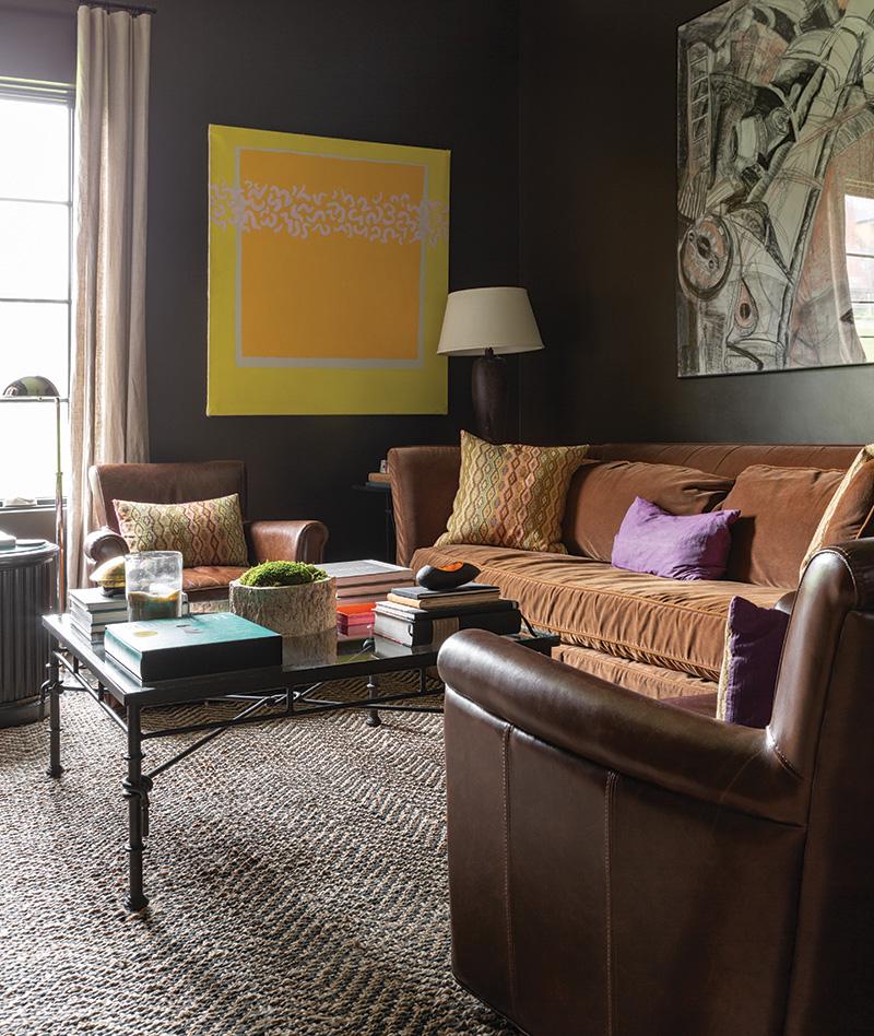
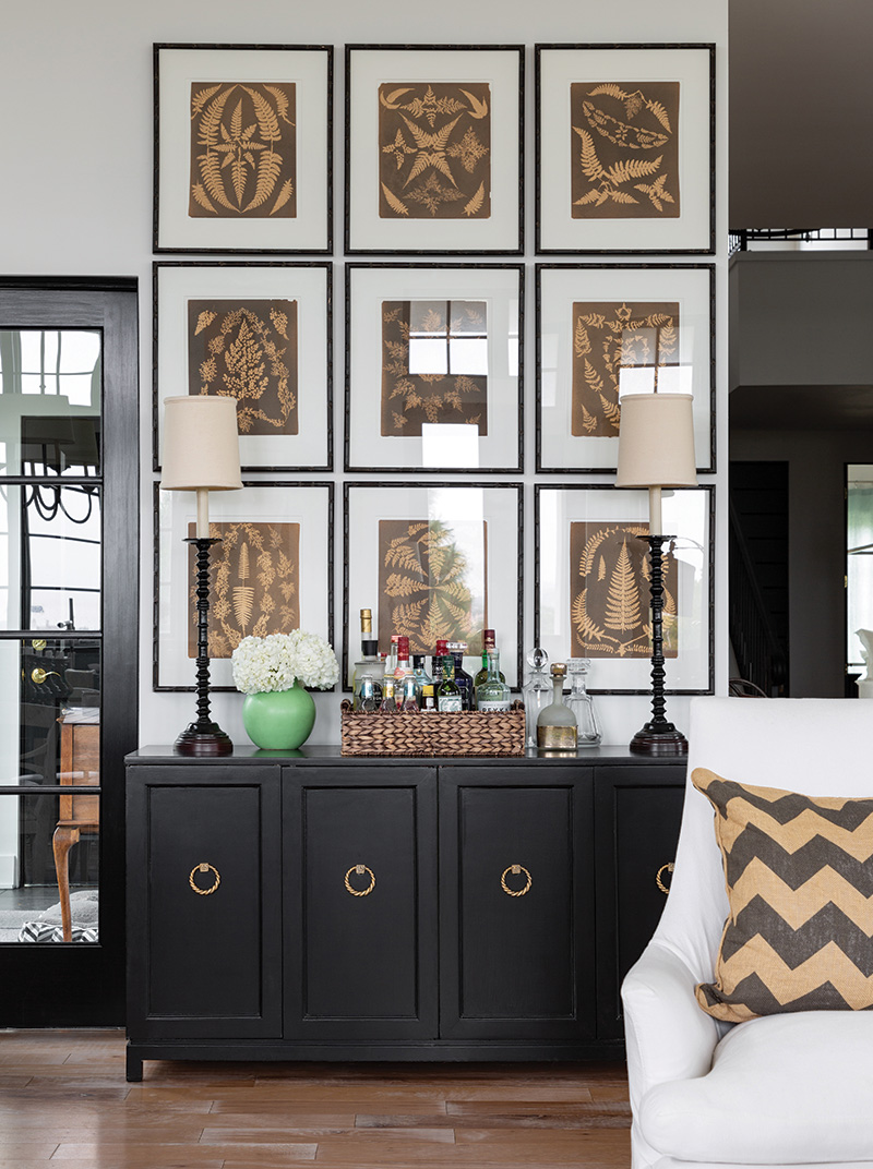
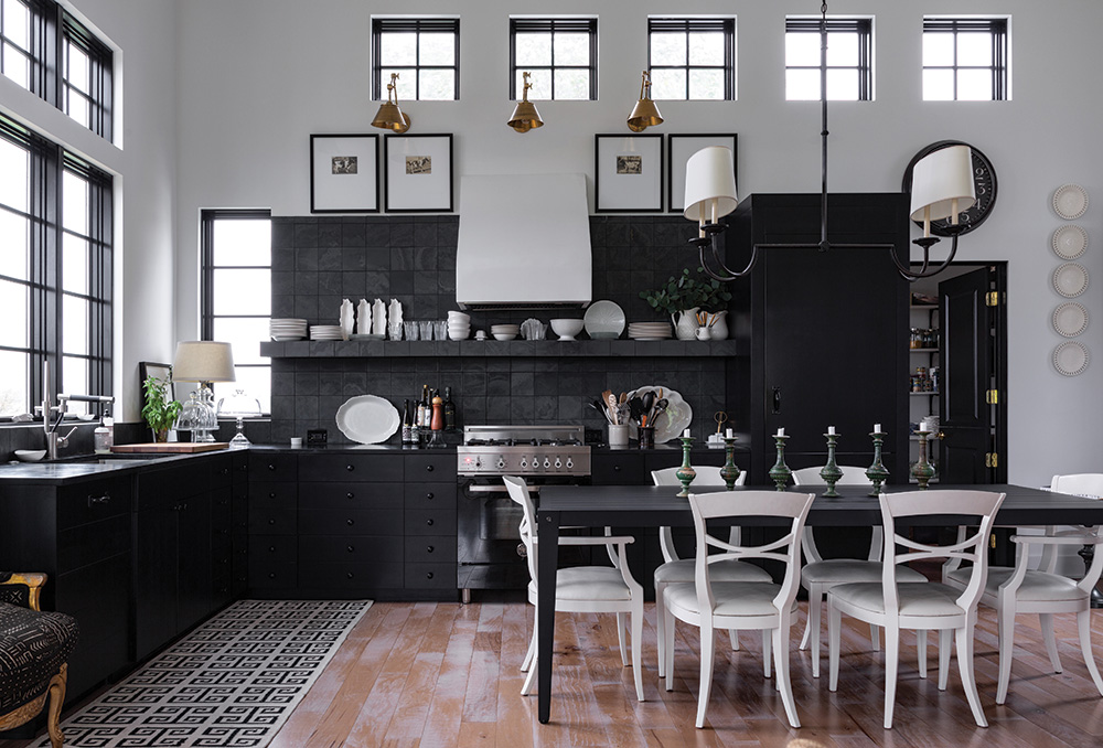
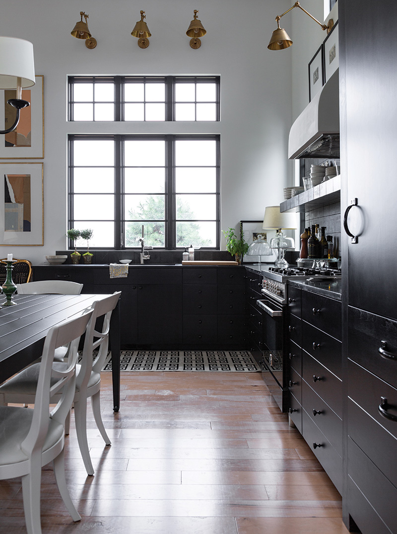
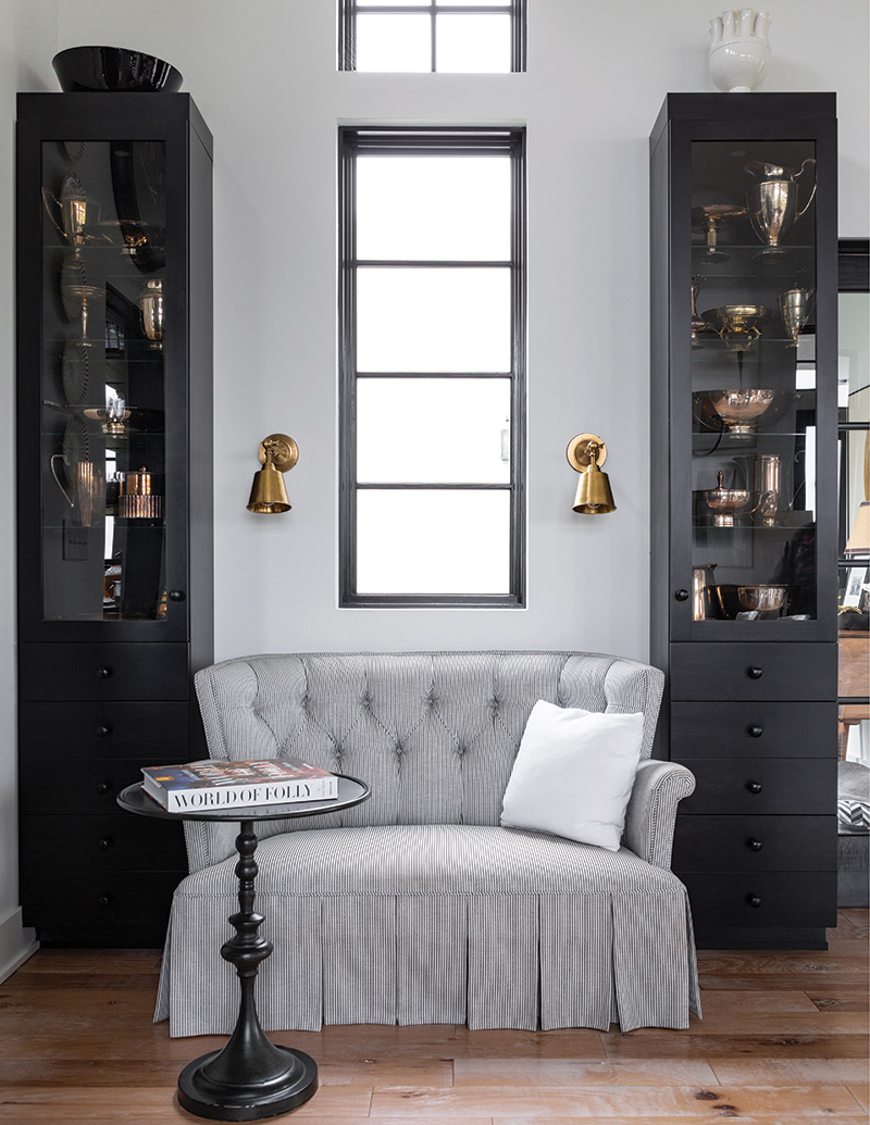
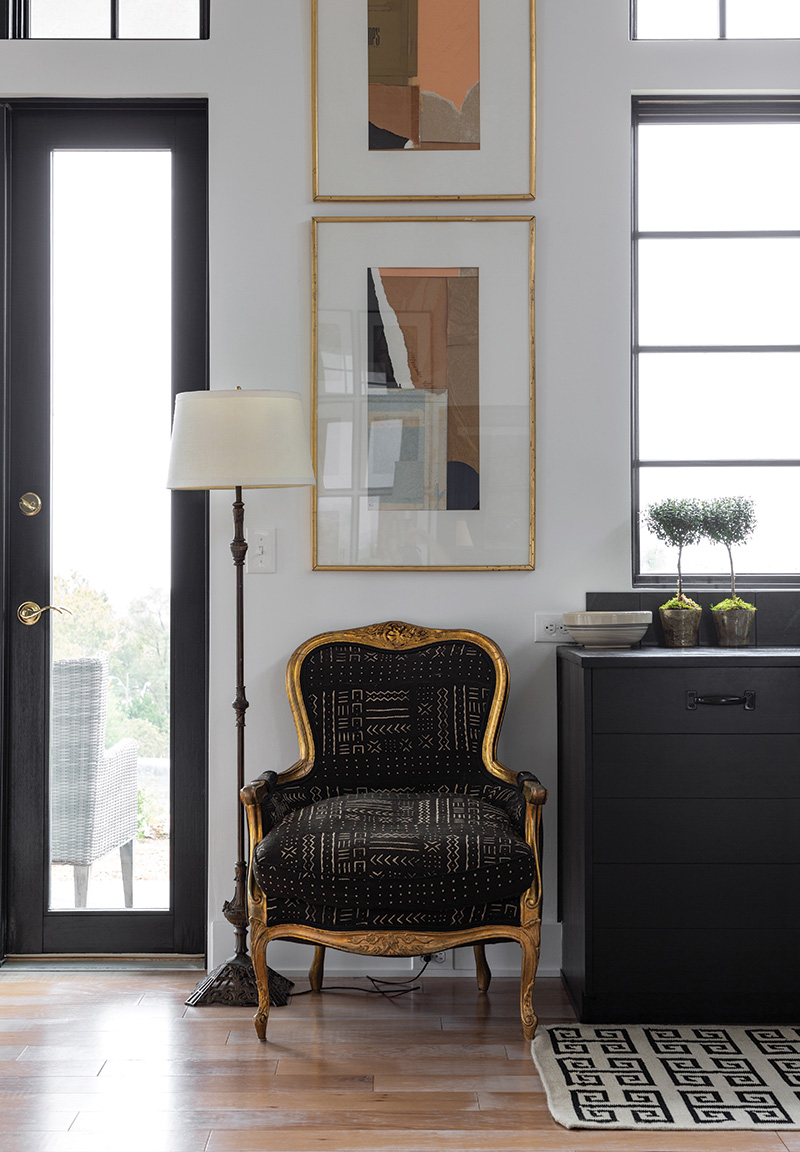
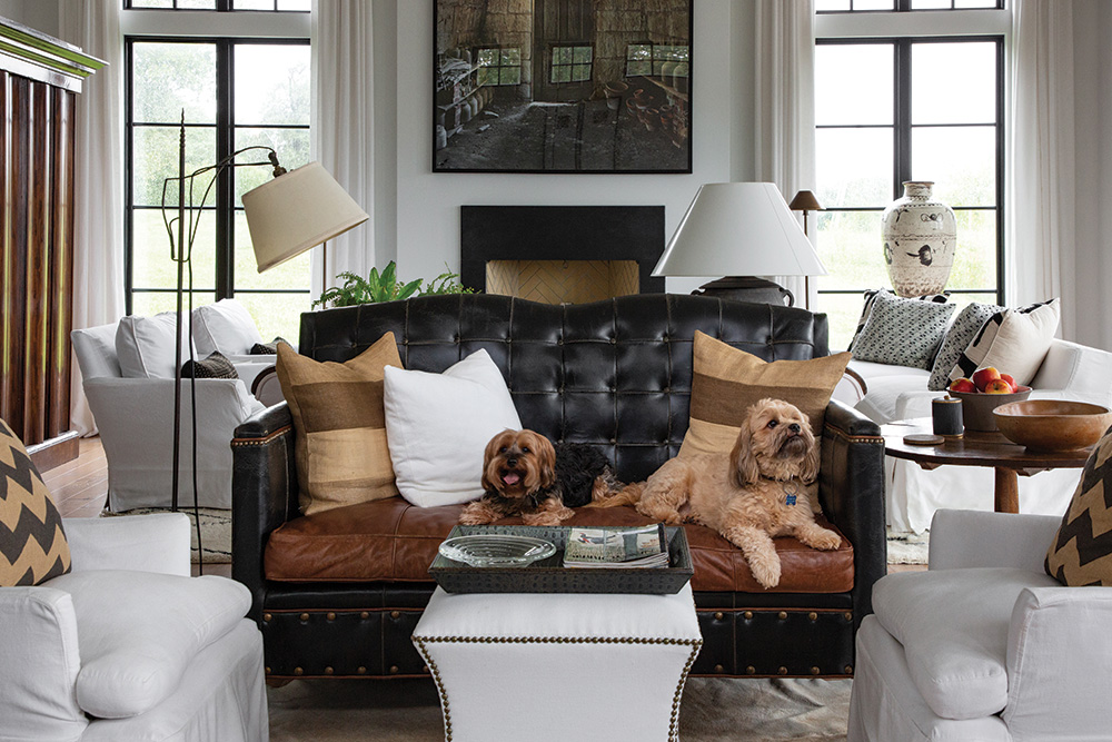
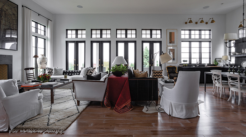
People are sometimes surprised to find that I designed the house from the inside out. The floor plan was fashioned around furniture we already had, so every sofa, chair, table, armoire, and credenza had to be measured to the inch. Art received the same treatment. I tucked in-floor outlets under chairs and sofas, so lamps could float in the space. I made sure we had the perfect space for everything we owned (and a couple of new pieces).
Our budget was tight, but everything we really wanted was right there on the plans, including the small “martini pool” in the back courtyard. (In my case you might call it a “white-wine pool.”)
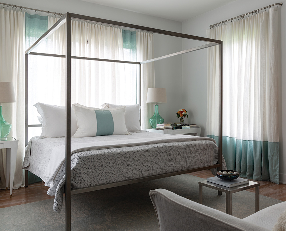
We wanted a small house (under 2,000 square feet) that lived big, and I think we succeeded. The great room toward the view is the living, dining, and kitchen, with a small pantry just to one side. A mudroom connects the garage and that previously mentioned doggie courtyard. The library—where we live most of the time because besides all our books it also holds the TV—is a small, cozy, dark chocolatey-brown room. Our master bedroom is the exact same size as our Roanoke bedroom because the size worked so well. The main hall provides a dramatic enough entrance, and the guest bedroom and bath are tucked upstairs.
Imagine our excitement, when after months of delays, they finally began digging the basement in November of 2015. That first day I got a call from the contractor: the ground was so porous that they needed to install 36 piers to support the house. Well, there went the pool.
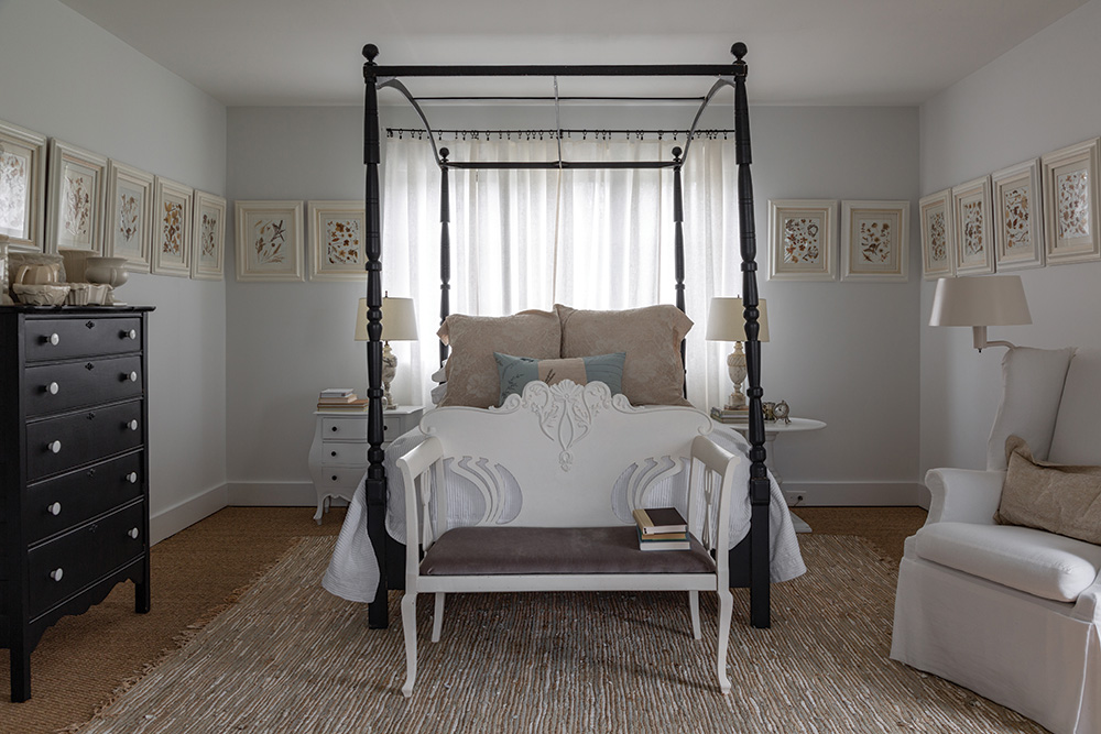
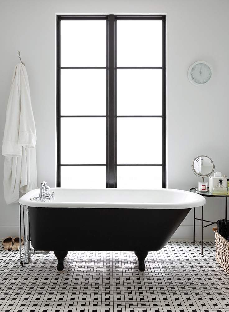
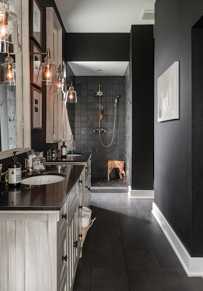
Even with all the setbacks and upsets, we love living on the hill. At night as we’re heading to bed and all the lights are off, the view from the great room still thrills.
But by now I know better than to say it’s our forever house.
The It List:
Architect: Craig Shaw, shawhofstra.com
Contractor: Design Build Services, cnichols@dbpartner.net
Floral Design: The Little Flower Shop, Thelittleflowershop.com
Furniture Maker: Castilleja Furniture | Objects, mattcastilleja.com
Kitchen Cabinetry: Portfolio Kitchen & Home, portfolio-home.com
Landscape Design: Arcadian Design, patrick@arcadiandesignkc.com
Lighting: Barbara Cosgrove Lighting, barbaracosgrovelamps.com
Rugs: Knotty Rug Co., knottyrug.com
Wallcovering: KDR Designer Showrooms, kdrshowrooms.com
Windows and Doors: Kansas City Building Supply, kcbuilding.com
Wrought Iron Fabricator: Kansas City Metalworks, Kansascitymetalworks.com

