Sophisticated Transitional
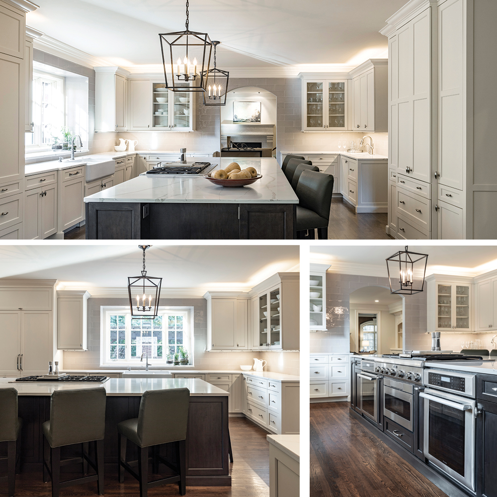
‘‘Everything in its place” could be the theme of this Mission Hills kitchen for a surgeon and his wife who love to cook. “They wanted a clean-lined, organized, and warm kitchen that brings out the architectural elements of their home,” says designer and owner Geri Higgins of Portfolio Kitchen & Home. “Stately, classic, and crisp.”
“We also wanted it to be multifunctional—to serve as a hearth room and a home office,” says the wife. “And bring as much light as possible into the room.”
“We like to cook together,” she says, so a six-burner Thermador flanked by two ovens provides ample operating room for the surgeon/chef and his sous chef wife. “We have a giant fireclay sink, which I love,” she says. And, of course, that’s in the clean-up zone with the dishwashers.
“When everything has a place tailored to how you live, it makes for a calm, easy place to be,” says Higgins.

La Dolce Vita
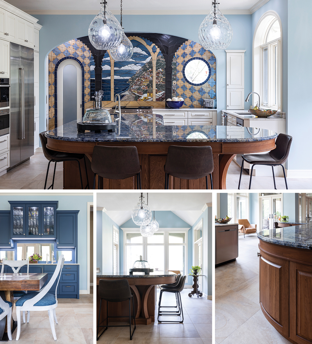
A family trip to the Amalfi Coast sparked a desire to turn a dated Leawood kitchen into a mesmerizing view of the sea. “We started with a photo I took on that trip,” says Lisa Crawford, Kansas City manager of DelBrenna Boutique, a third-generation Italian jewelry company based in Cortona of Under the Tuscan Sun fame.
Lisa and her husband, Kevin, a construction executive with MasTec, called on Cherie Brown of Kitchens by Kleweno to make their vision come true. First up was the focal point, a remarkable and colorful trompe l’oeil Amalfi view executed by tilemasters Jake and Julie Bond. ‘It gives us something beautiful to look at when we cook,” says Lisa. The pale blue hue of the walls echoes the sea blue color of the beverage area cabinetry.
Wolf and Sub-Zero appliances make the meal prep part of the pleasure, so everyone can enjoy “an Italian zest for life and the pleasures of the table,” says Lisa.

Modern Mix
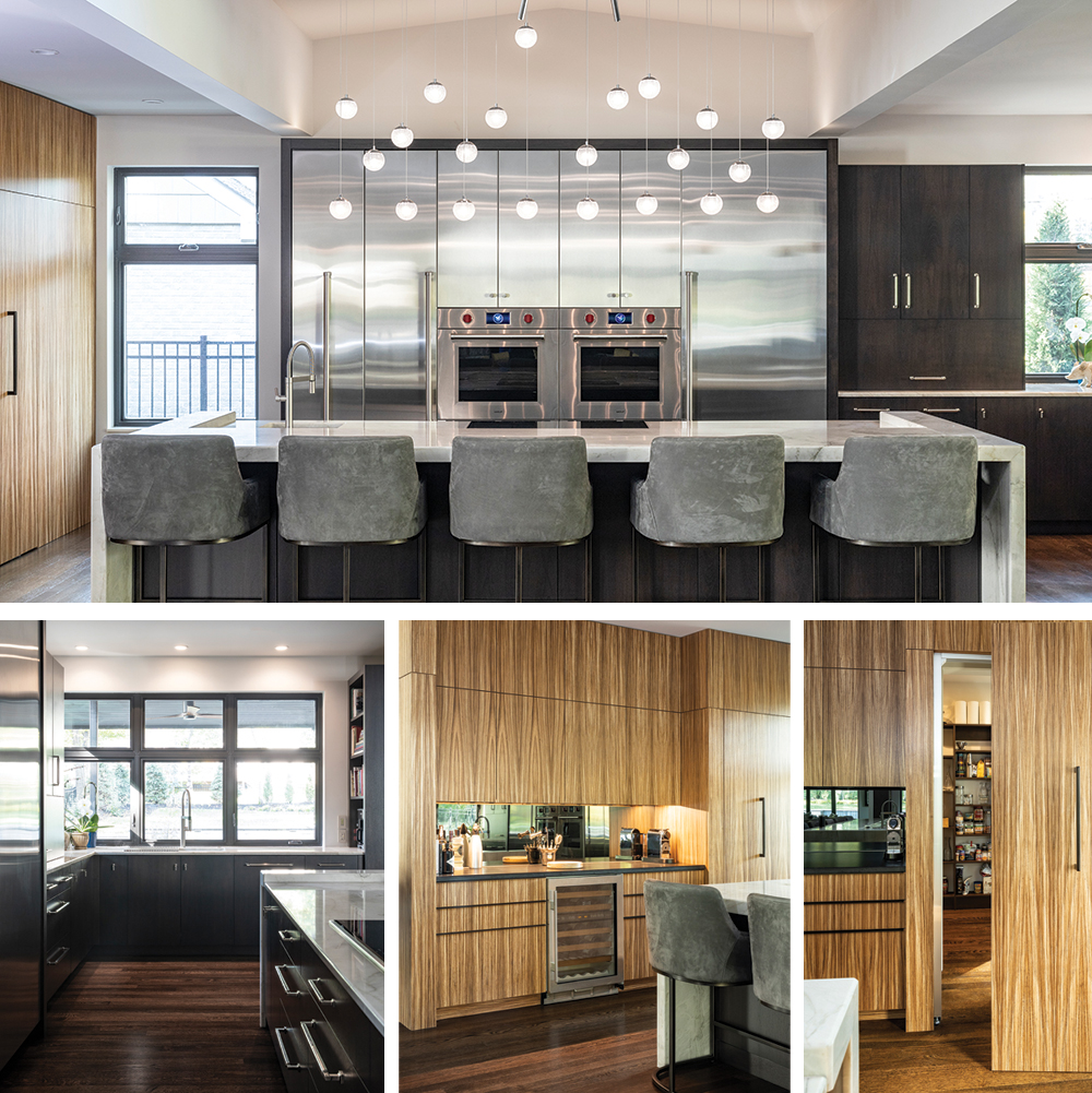
When Karen and John Yungmeyer pop open a bottle of bubbly in their Fairway kitchen, the party begins. With nibbles prepared and ready in warming drawers, guests gathering around a big island and someone playing the baby grand piano nearby, magic happens.
Maybe it’s partly due to the spell of the kitchen, cast by three talented people: Sue Shinneman of Kitchen Studio Kansas City, Terry Tevis of Tevis Architects, and interior designer Kurt Knapstein.
“We have so much light, I feel like I’m at a spa,” says Karen Yungmeyer. Shinneman and Knapstein designed a lower-than-standard Wolf induction cooktop in the island and side-by-side ovens to accommodate the petite cook. “It’s a wonderful kitchen,” Karen says. “Everything fits together beautifully.”

Pattern Play
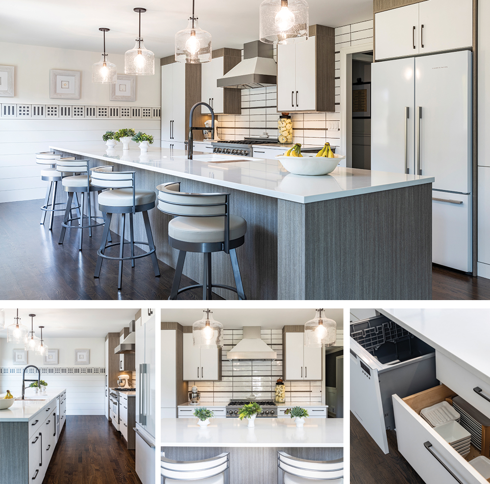
Needlepoint designer Kam Snyder and her husband, John, a sales executive, loved their quirky 1960s house in Old Leawood. They just didn’t like the kitchen. So they asked Lisa Otterness of Classic Kitchens Design Studio to reimagine it. “It took a bit of layered problem-solving,” says Otterness.
When they pulled everything away from the windows—surprise!—it was a little too obvious that the windows were different heights. They needed an architectural detail to take the eye somewhere else, hence the wainscoting with the band of graphic cement tile that Kam loves.
Most of the storage is under the 16-foot island of matte Italian laminate cabinets, topped with quartz counters and accented with black hardware. “Think off the wall,” suggests Otterness. “Dishes and glassware can go in a drawer.” A ZLine range beckons John to whip up something delicious.
“It doesn’t get much better than making my morning coffee with the light streaming in from the windows,” says Kam.


