
This Leawood home has all the hallmarks of traditional American architecture—sprawling lines, generous porches, peaked gables, and that feeling of easy well-being.
It didn’t just happen. Three and a half years ago, this house came to life detail by detail, the vision of Casey Cooley-Brock and her husband, Randy, working with architect Scott Bickford and designer Carmen Thomas with Tran + Thomas Design Studio. The couple owns the Five Guys franchises in the Kansas City area, so welcoming guests is part of their D.N.A. They wanted a house that would embrace friends and family, says Casey. It also impresses.
Getting there was half the fun. The two most important considerations? “Space and light,” Cooley-Brock says. “I spent a lot of time thinking about that.” About how the rooms would face—the western dining room catches the light of sundown, the eastern kitchen gets the “soft, beautiful early morning sun when I have my coffee,” she says. She and Thomas walked out room dimensions and ceiling heights—how big, how high feels airy but still cozy?—to get just the right balance.
Cooley-Brock hates wasted space, so there are no unreachable cabinets or lofty perches for objects that only gather dust. “We use every room,” she says.
And when it came to lighting, she relied on Thomas’s sage advice—go above and beyond your builder’s lighting allowance. “We spent three times as much, but it was well worth it,” admits Cooley-Brock. Says Thomas, “Lighting—especially chandeliers—are the jewelry of your home. They finish the look of a room.”
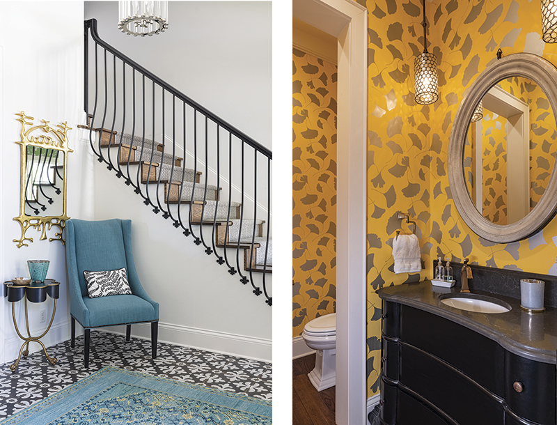
When Cooley-Brock first started working with Thomas, “I didn’t know my own style,” she admits. “At one of the first meetings, they showed me pictures of materials and I came to realize I love a neutral palette with pops of color, wood, iron, and tile. So, we have lots throughout the house.”
The family also came from a “home full of hand-me-downs,” Cooley-Brock says, “so we went big on furniture and accessories. This is the home our three teenage children, and Finn the cavapoo, are growing up in.”
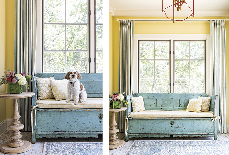
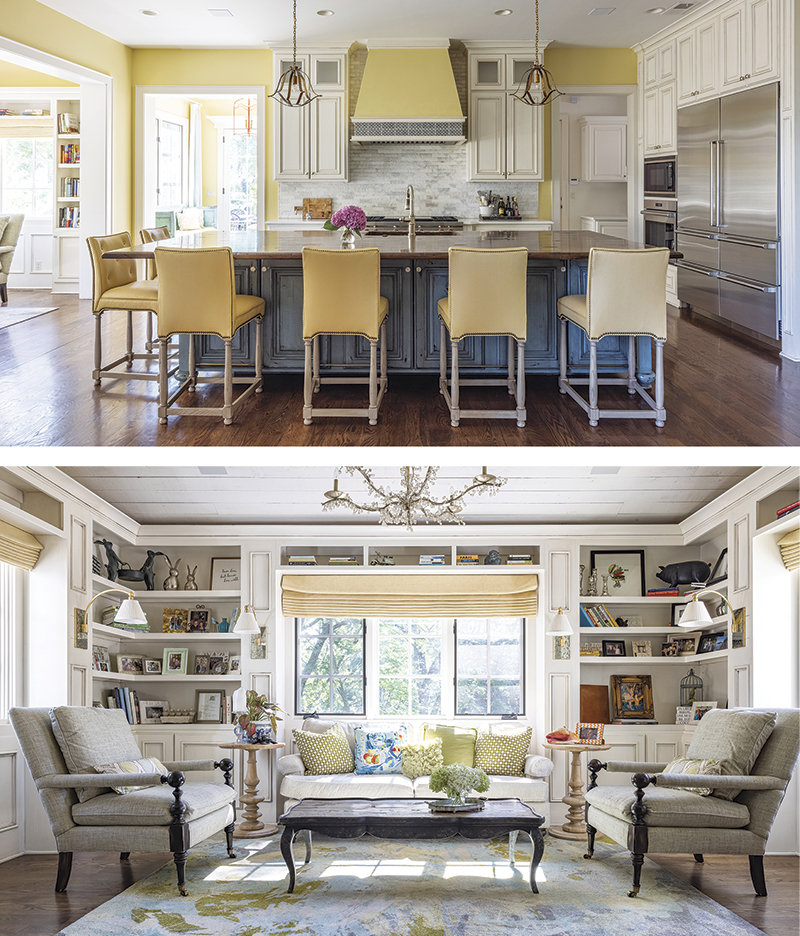
The heart of the home is what Cooley-Brock calls the cozy corner, a bookshelf-lined sitting area to the rear of the kitchen, with views to the backyard. The seating in neutral linen-like fabrics nestles around a coffee table and under a Currey & Co. chandelier. Nearby is a garden room with the blue-green accents and sunny colors that pop up in the rest of the house.
The kitchen, with traditional creamy cabinetry and a large wood-topped island, sings a love song to tile: marble subway behind the Wolf range, glazed Moroccan medallions on the interior of the curved archway. It’s also highly functional, with a butler’s pantry nearby to house all the clutter, and two ovens and two dishwashers to handle a crowd.
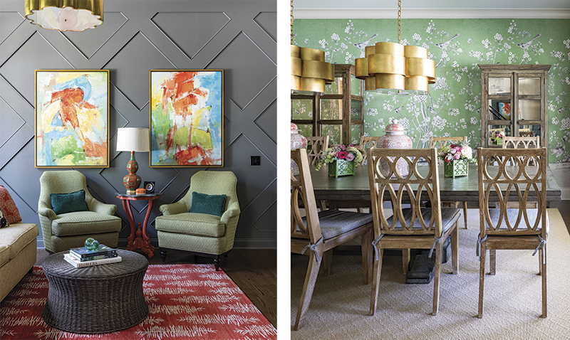
The dining room shows how working with a designer pays design dividends with pairings most homeowners wouldn’t envision. They make this room. It features a traditional Schumacher Chinoiserie wallpaper in an emerald green amidst a pair of curvy gilded Visual Comfort chandeliers, draperies in a delicate red print with ball fringe, and bleached-wood chairs that add a casual note to what could have been a formal and rather stuffy space. “I spend lots of time in this room,” confesses Cooley-Brock.
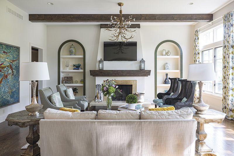
The kitchen opens to the living room with tall windows framed with patterned draperies. Arched shelves on either side of the fireplace also accentuate the height. “The light here is beautiful,” she says. Basket-weave tile surrounding the fireplace and a heavy wooden mantel add texture and heft to a room that soars.
The principal bedroom, painted, appropriately, in soft blue Sherwin-Williams’ Quietude, exudes just that. The tray ceiling is papered in a metallic damask pattern, making an interesting play of light from the capiz-shell chandelier.
The spa-like principal bath features a generous soaking tub and a Murano glass chandelier for a hint of luxury. A laundry room right off the bath and a generous walk-in closet add the practical touches.
Painted in Sherwin Williams’ dark gray Grizzle, the paneling in the study features a diagonal pattern that adds interest to the small room, a design idea from Thomas.
“We designed our house to embrace rather than impress,” says Cooley-Brock. And if it could give you a genteel hug, it would.
The It List
Architect
Bickford and Company
Builder
Arch Design Builders
Interior Design
Tran + Thomas Design Studio
Flowers
Randy Neal Floral Design


