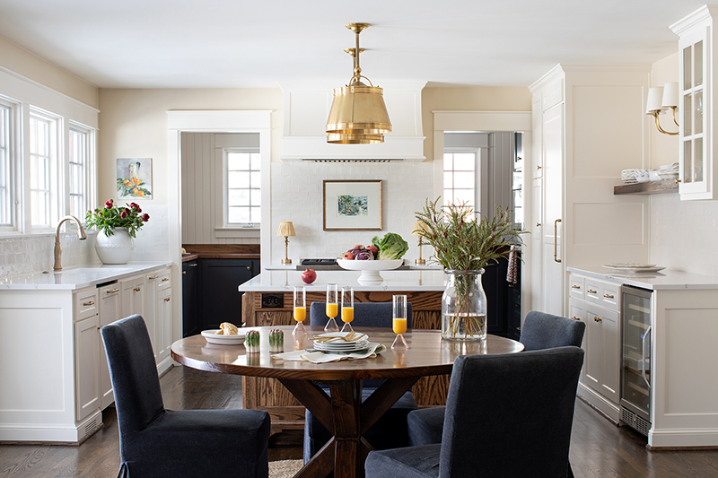
Dual Zones
When Ashley and Ryan Young refreshed their Prairie Village kitchen, they enlisted the help of Kylie Scovell Brewer with Scovell Remodeling. “Ashley and Ryan love Colorado and travel to Italy often, so we wanted to bring those elements in,” says Brewer. “They love to cook, but don’t like the mess.”
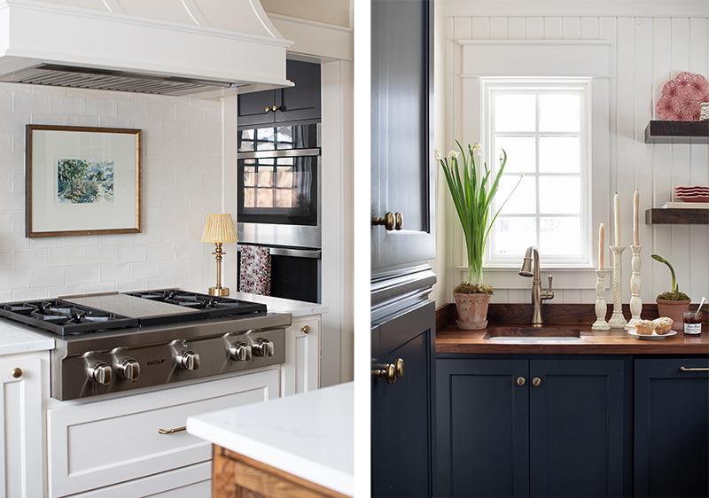
The solution? A dual-zone kitchen with open space for cooking and gathering and a recessed “butlery” for prep. The bright, airy space is centered around a custom Unruh walnut table and features custom Profile cabinetry and easy-to-clean quartz countertops. An island of plain-sawn white oak across from the Wolf cooktop keeps the cook’s ingredients handy. A trio of windows over the sink brings the outdoors in.
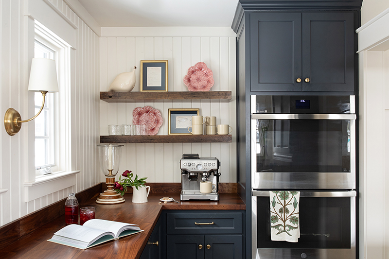
The butlery, repurposed from a former laundry room and powder bath, features cabinetry painted a Farrow & Ball teal and walnut countertops from Elmwood Reclaimed Timber. Floating walnut shelves hold framed handwritten recipes for Grandma’s pie and Mom’s cookies. A second prep sink, built-in freezer shelves, an espresso machine, and GE double ovens help organize much of the kitchen prep. Styling by Kristin Holton of Estately.
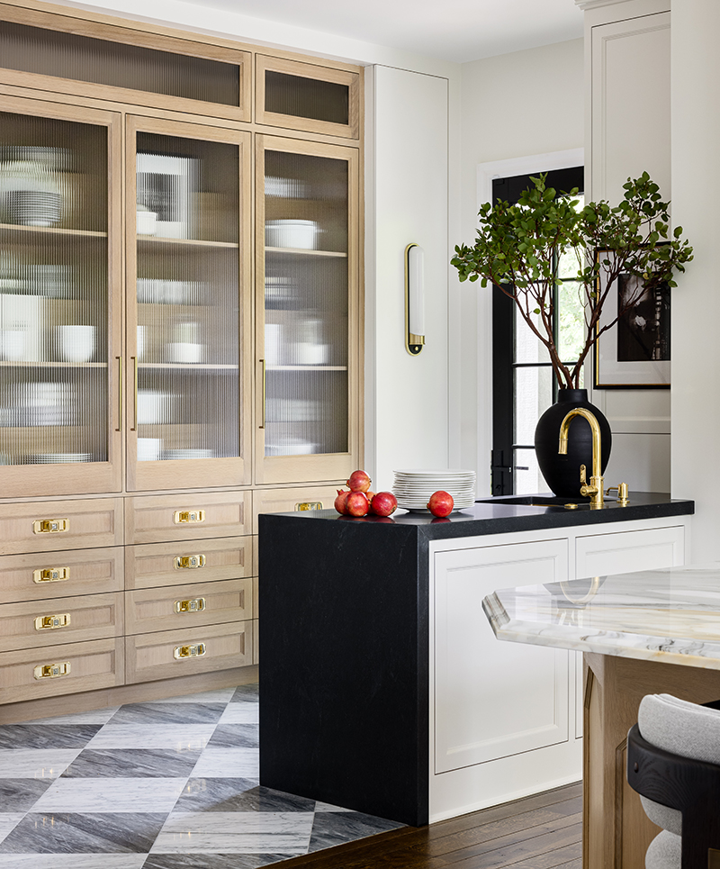
Contemporary Classic
The homeowners of this Loch Lloyd kitchen entertain quite a lot, says designer Laura McCroskey with McCroskey Interiors, but their old kitchen didn’t quite deliver in function or style. McCroskey opened it up, while keeping the basic footprint. Now a pony wall peninsula in waterfall honed Negresco granite, a marble checkerboard floor, and a bleached-oak pantry with reeded glass and plenty of drawers provide a mix of materials.
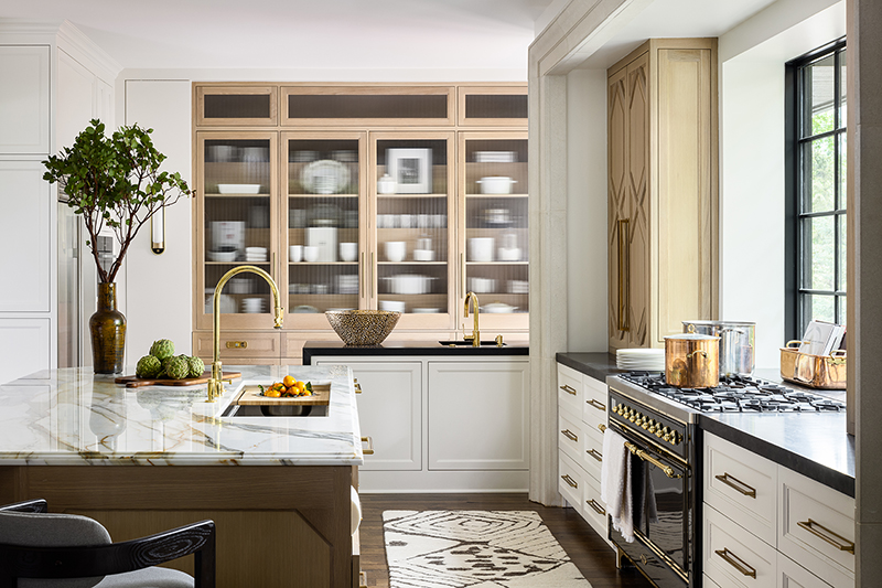
Along the back wall, an eight-foot-wide black-framed window, with a cast-stone surround by ADI, would be right at home in a city loft. Framed photos by Kansas City artist Kim Taggart are from the McCroskey Interiors art collection. The streamlined vent over the Ilve range faces the window.
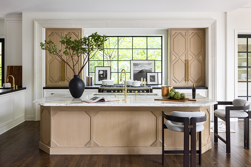
The large island, with its notched marble countertop, holds a 4½-foot- sink and is surrounded by stylish upholstered chairs by Olivya Stone. Ostby Construction helped make it all happen.
Banquette Bonus
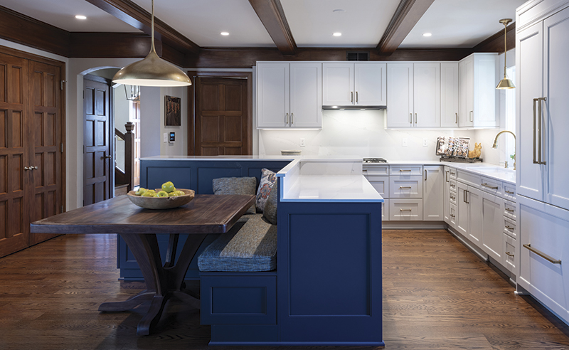
Martin and Sarah Loring’s Tudor-ish home off Ward Parkway had a lot of great features, but the kitchen wasn’t one of them. Enter designer Lisa Otterness with Classic Kitchens, who waved a magic wand and gave Sarah the double ovens she so desired—just not in the space you would expect. The deep blue-hued banquette is enclosed by angled counters at two different heights. The 36-inch height cabinets and counter function as the baking center, while the 42-inch counter tops the two side-by-side ovens. There’s also a drawer microwave.
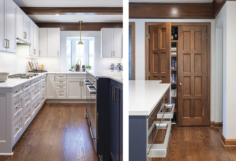
Making it all work was expert cabinet installer Paul Short, whose son is married to the Lorings’ daughter. “I couldn’t do what I do without him,” says Otterness.
Another plus—when they scraped a bit off the formerly white-painted beams, they discovered the original walnut and brought the finish back. “A great retrofit honors the age of the home,” says Otterness.
European Chic
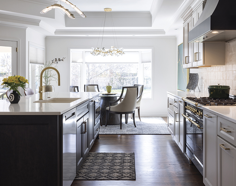
“You do you,” the Prairie Village couple told Belgian-born designer Karin Ross, “we are open to different things,” and it was music to her ears. She pulled out all the stops of her signature European-chic kitchen design with elements that “play well together,” she says.
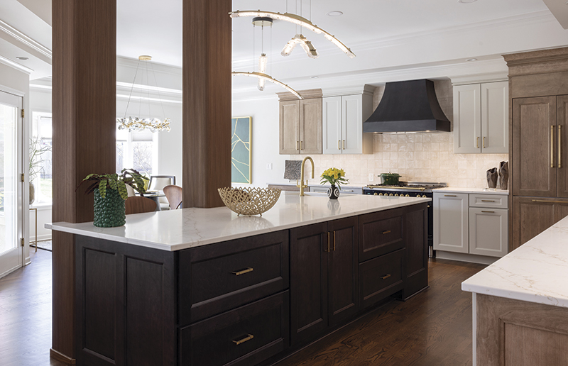
A leafy motif carries through the space: a trio of pendant lights like falling birch leaves, bar stools imported from Spain with backs like ginkgo biloba leaves, and a branchy chandelier over the breakfast table.
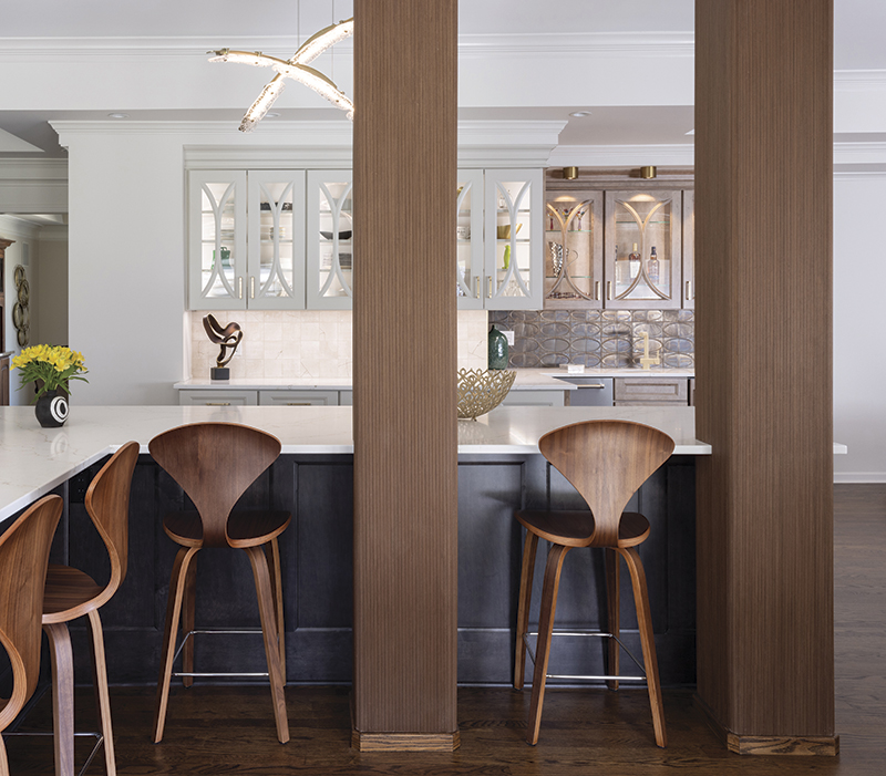
Wood accents include painted maple and natural cherry cabinetry and a special teak that wraps around existing columns. Quartz countertops pair practicality with a little sparkle. Custom hand-formed European tiles with gold veining subtly highlight the cooking area, while oval tiles with a metallic sheen draw the eye to the bar area.
Contemporary Tudor
In Brookside, Shelly and Mark Kramer were contemplating a big outdoor kitchen project when they realized their indoor kitchen and little-used dining room needed to come first. “We wanted a comfortable space with a cozy hang-out vibe for our family,” says Shelly. “Now I love it when the morning sun floods the room with light.”
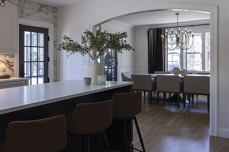
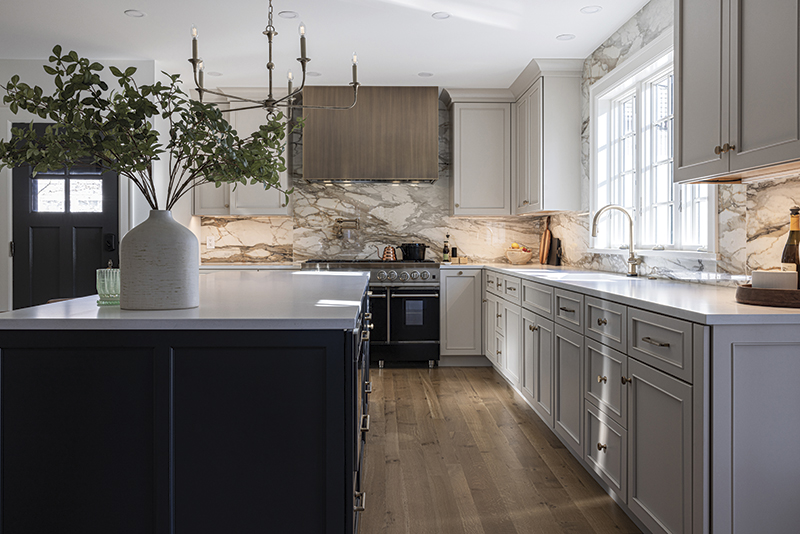
“We came on to make sure their project is perfect,” says Portfolio Kitchen and Home owner and designer Geri Higgins. “We wanted to protect the dignity of the house, change the layout, and lighten it up.” A large arched opening with custom molding brings the dining room in. Pale, paneled cabinets reference the Tudor style, while large-format Calacatta tiles in caramel and camel add warmth to the backsplash. They tested 25 colors before coming up with the perfect off-white for the walls.
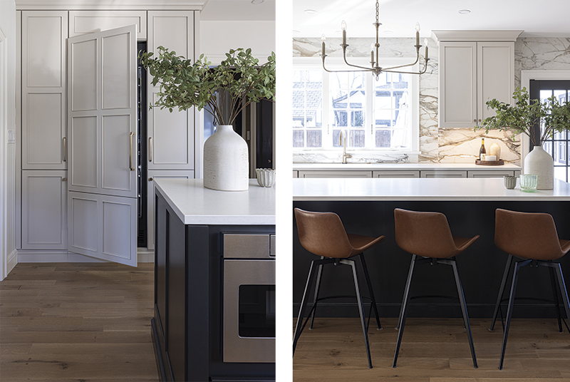
Cabinets painted a soft greige hue and a striated bronze range hood suggest the past, while chandeliers in a spare design hint at contemporary. “It’s a great mix of fresh, modern, and traditional,” says Higgins.


