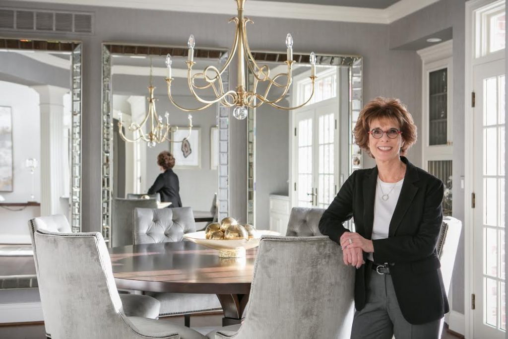
We wanted to hear from local interior designers about their most memorable makeover—the good, the bad, and the ugly. Veteran designer Arlene Ladegaard of Design Connection, Inc., shares a classic dining room redo. To this day, this Overland Park project for her clients (who were updating their 2002 home) remains her favorite:

I love this dining room. It is elegant, yet understated, in its beauty.
When we first viewed the home, I almost missed this space. It’s the first room when you enter this grand house—over on the right side of the entryway. But it was dark and uneventful.

I knew it could be spectacular.
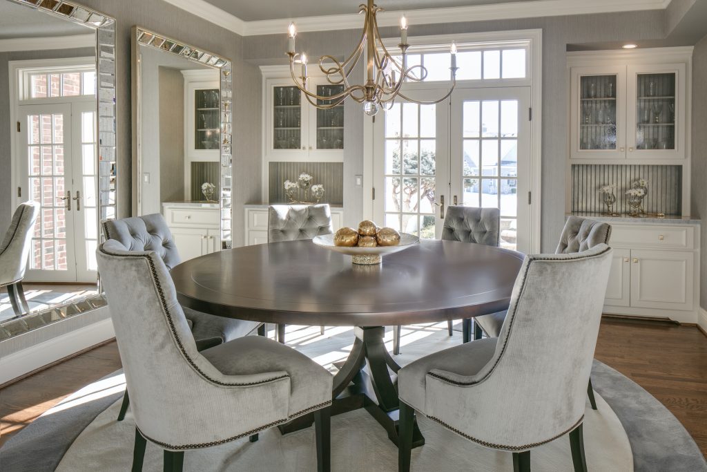
First, I selected a textured metallic wallcovering to add depth to the surrounding walls. The table is a rich gorgeous brown alder with transitional lines. The chair fabric—a luxurious gray velvet—added another layer of depth and elegance. (Gold is always stunning and was selected for the finish for the dining room chandler with a drop crystal ball that finished the bottom of the fixture.)

Three oversized mirrors were hung in an inspired moment and are the best addition to this space. (It took three large men to hang them, too.) As we were hanging the mirrors, my client turned and remarked, “Every time I pass the dining room, I get to see myself three times!”—and we all chuckled.
In the ’80s, we used mirrors that were glued to the walls and usually had bevels on all sides. They were effective in making rooms look larger and added lots of drama. The use of mirrors in this space actually did the same thing but was more stylish. Plus, the antique gold in the frames added color and dimension. For such a small space, it’s layered in elegance, drama, and at night when the table is set, it’s quite memorable.
It’s my favorite room ever!


