It’s All There in Black and White.
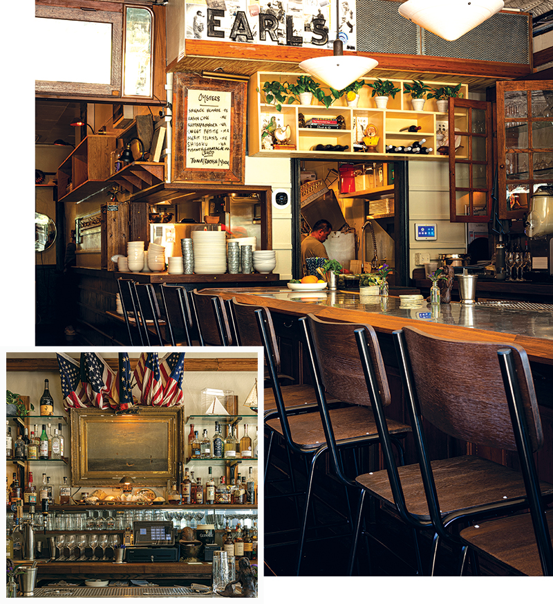
I’m going to tell you off the bat, I have an interest in Earl’s Premier. To begin, I have a huge crush on the chef. (I do, though Todd Schulte happens to be my husband as well.) Along with our co-owners Jen and Cory Dannehl, we spent a lot of time cleaning and painting and finding our way to make Earl’s just how the crusty old sailor would want it to be. (We only wish he saw it more often.) Mostly, we just tried to stay out of the way of Kansas City legend John O’Brien, who knows his way around restaurant design.
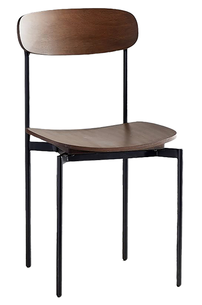
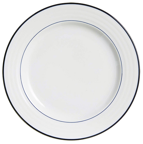
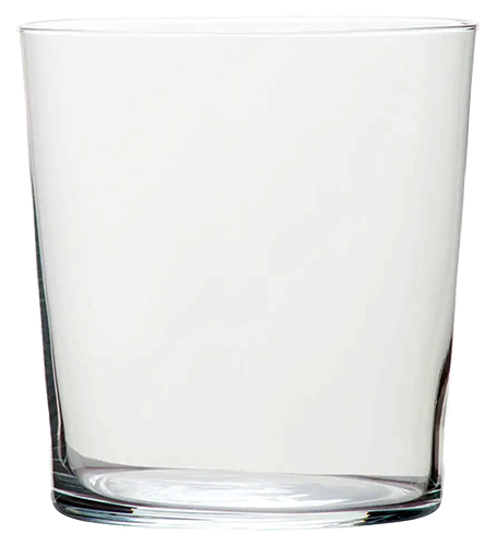
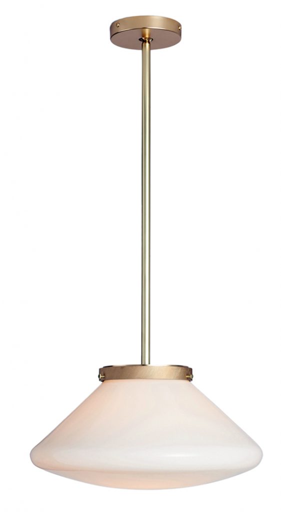
I’m not certain anyone really wants their home to look like a New England oyster bar, but there are some elements that translate well. The metal-and-wood chairs would be happy in a range of rooms from modern to traditional. While the opaline lights would require some internet hunting, Rejuvenation has new lighting that might fit the bill. Tableware is easier. White dishes with a blue band add a jaunty air to the table, and I never tire of the CB2 Marta glasses that we use at Earl’s and at home.
The painting behind the bar came from Urban Mining. Todd stalked that painting for months, and I just kept shaking my head. You can see how things worked out. The ceiling and walls are fittingly Sherwin Williams’s Oyster Bar, and the black on the walls here and there is Benjamin Moore’s Obsidian. If you need a sample of either one, one of the four of us is bound to still have some on our clothes that we can show you.
