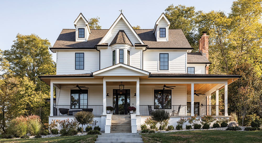
Three years ago, Tim Jonkman drove past a newer Victorian-style house situated on 43 acres in Platte City that was for sale and called his wife, Lana. They both looked, fell in love, and put in an offer that day.
The kicker? To make it their own, they’d need to redo it. And the paint wasn’t even dry on their current home, freshly remodeled.
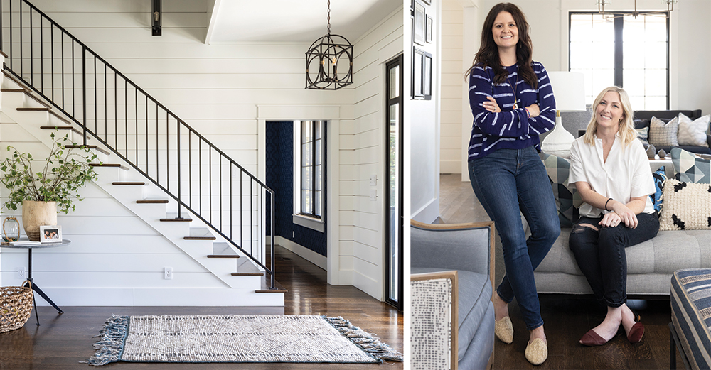
But no problem. Tim owns Jonkman Construction, whose high-end commercial projects include the Restaurant at 1900. And the couple has a great relationship with Katy Cassaw and Kat Benson of Nest Interiors, who had worked on their previous house, which sold right away. “We could help them visualize what could be in the new house,” says Cassaw. “And find places for what was important to them,” adds Benson.
It certainly helped that the couple knew what they wanted: modern farmhouse. But they needed help on how to get there.
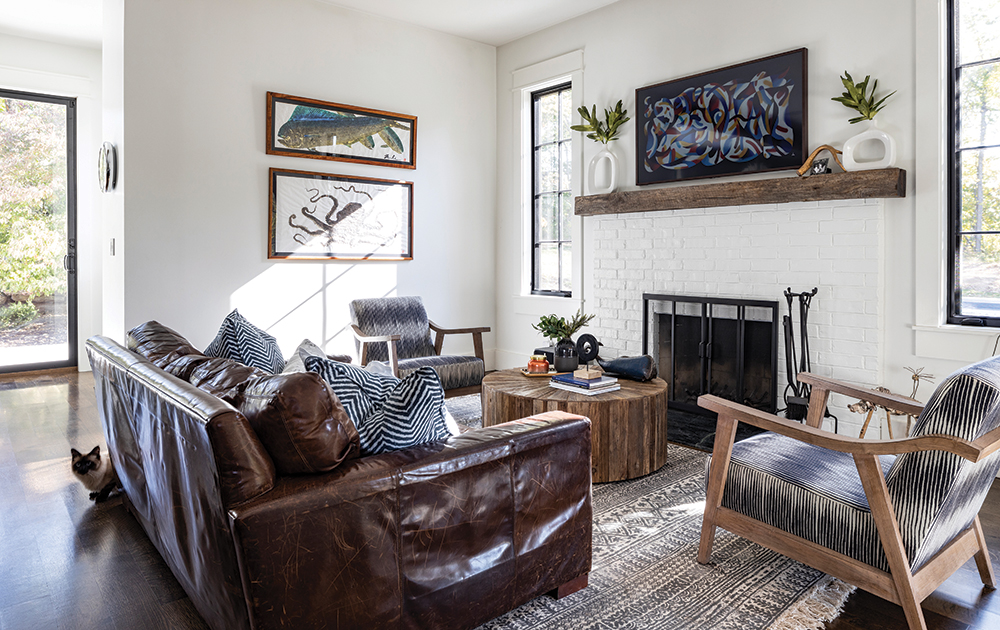
Tim listed rift-sawn and quarter-sawn oak floors, a butler’s kitchen that could hide his dinner prep mess, and a minimalist approach as must-haves. Maybe a touch of industrial in the black windows.
Lana leaned toward clean lines, a place to display her collection of sand from family beach vacations and dirt from baseball games at Kauffman Stadium, and definitely a great tub for soaking. Oh, and chickens to peck around in the yard, namely Winona, Snickers, and Ivana.
They also knew what they didn’t want: No country clichés. No dust-catching collections of vintage kitchen items, no ruffles, no stuff.
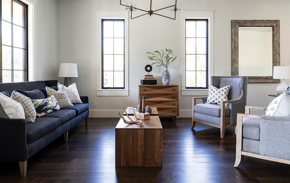
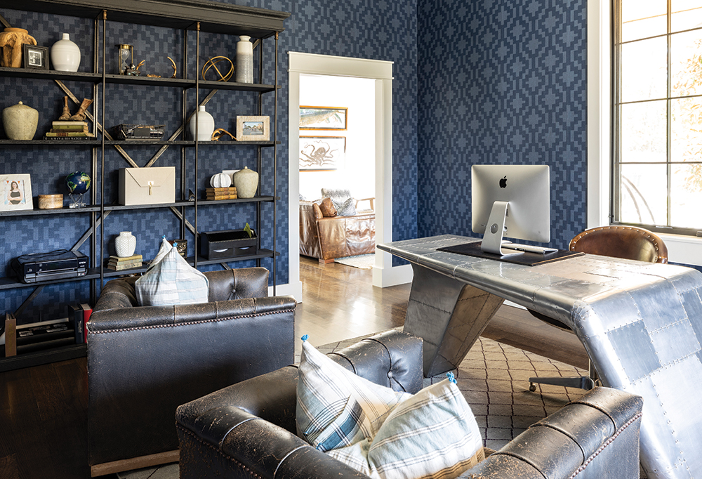
The Nest team spoke “modern farmhouse” fluently, coming up with a streamlined design entailing white walls, black accents and metals, shiplap, natural woods, barn doors, quilt patterns, a hint of color, and just a touch of modern graphic wallpaper here and there.
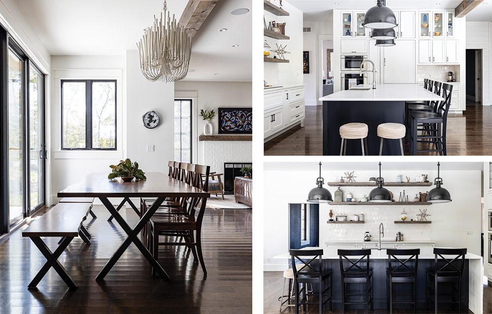
These elements flow throughout the house, from the shiplap entryway to the barn doors closing off the butler’s kitchen to the office wallpapered in a vibrant blue pattern.
The welcoming front porch, with its ceiling of natural cedar, holds traditional black rocking chairs, but also modern heated seating. “I don’t know what I like until I see it,” says Tim, but when he saw the curvaceous concrete outdoor furniture by Galanter & Jones in San Francisco, it was exactly what he wanted. Plug it in and the family stays toasty even on the porch, even on a cold winter day. And the furniture never blows away.
The porch is Lana’s favorite place to wait for fifth-grader Beau to walk up the long driveway from the bus and greet high schoolers Ava and Gage when they’re expected home. Seeing them “just makes me happy,” says Lana.
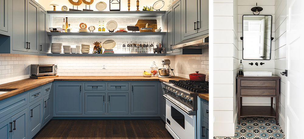
Custom walnut cabinetry throughout the home is by SquareOneStudio, a company Tim has used in commercial projects. “My thing is the details,” he says. As the person doing much of the cooking, he loves that the contemporary white and frosted-glass barn doors on the butler’s kitchen can close to hide the coffeemaker, air fryer, toaster oven, and all the crumbs so that the main kitchen stays tidy.
The open kitchen, the heart of the house, also features an apron-front sink made of cast concrete resin, a huge island, hexagonal tile, a long cabinet wall, and natural wood open shelving.
The powder bath sheathed in shiplap shows a quilt-patterned Soci cement tile underfoot.
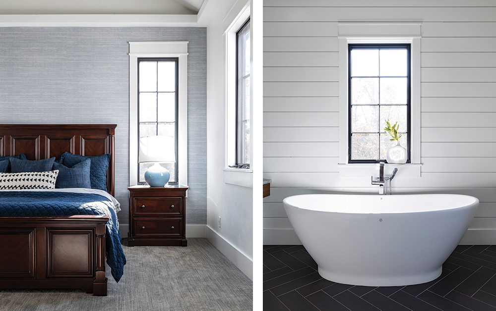
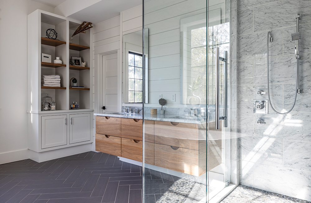
The principal bedroom walls are papered in a pale blue Phillip Jeffries grasscloth for a whisper of color. The Zen-like feel continues in the principal bath, where an egg-shaped tub is the modern take on the Victorian claw foot and black-and-white tile takes on a whole new look.
Back-to-back remodeling is not on everyone’s wish list, but Lana says, “If you think you want to do it, do it. You’ll regret it if you don’t.” Their remodeling turned out to be very timely after the pandemic hit. “We have lots of space to be together but be free.”
The It List
Cabinetry
SquareOneStudio
Construction
Jonkman Construction
Interior Design
Nest Interiors


