Calm. Luxurious. Polished.
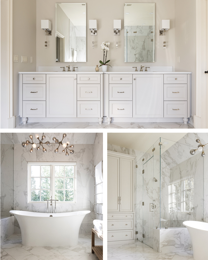
Five months before Covid hit, Mission Hills homeowners Jennifer Bailey and her surgeon husband, Alex, were trying out a bathtub at Portfolio Kitchen & Home’s showroom. “We didn’t know then what we know now,” says Bailey. “The importance of being comforted and relaxing at home.”
In an update of their home, they wanted a master bath with more of a spa feel. The tub, the sculptural Toulouse by Victoria & Albert, took center stage. “It’s made of volcanic limestone from Italy,” says Geri Higgins, owner of Portfolio, “so it helps the water stay warmer, longer.” A chandelier by Corbett looks like bubbles when you’re soaking in the tub, says Bailey. A towel-warmer adds another soothing luxury. The polished double armoire, an elegant twist on a linen cupboard, offers plenty of storage, also adding to that feeling of well-being. As do the two integrally lit mirrors, recessed in the wall like medicine cabinets, and complete with charging stations and electrical outlets. Calacatta marble with greige veining brings the polish.
“When you’re in here, you feel like you can be anywhere,” says Bailey. “You bring the five-star hotel to you.”

Timeless Black and White
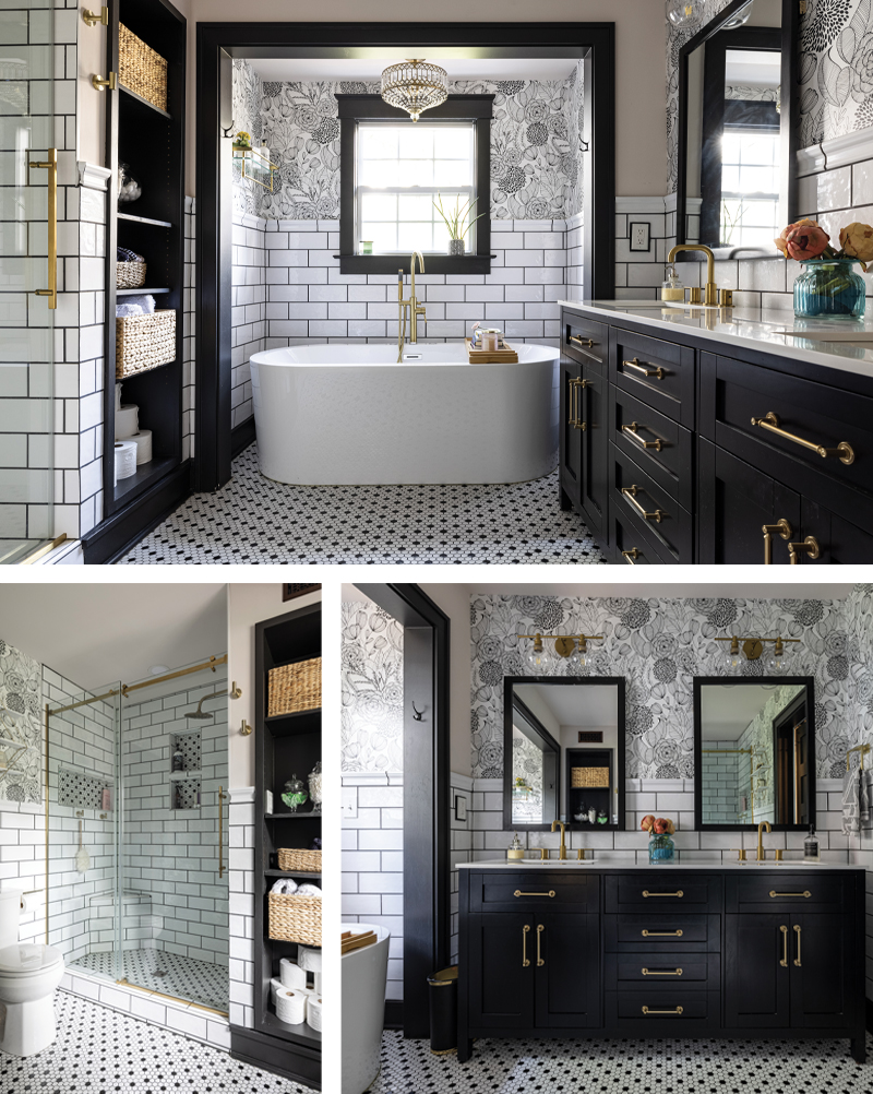
Alyvia Elliott’s 1913 Brookside home was due for the refresh that she and her husband had planned for ages. Then he passed away suddenly. Elliott knew that the best therapy for her would be a project. And then the pandemic hit. “I used grief as a tool,” she says. “I wanted everything to make sense.”
As a nurse with three kids and a demanding job as a foster-care nurse case manager, the tub was key. “At the end of the day, I need to just get away and soak,” she says. “So everything is intentional, where this is, where that is, so I have a sense of well-being.”
Sourcing mostly online, Elliott built her spa bathroom tile by tile, with a timeless, classic feel using a black-and-white color scheme. Matte black cabinetry and the tub came from Wayfair, the peel-and-stick wallpaper from Amazon, the tile came from both Wayfair and locally from Décor and More. Keepsakes from her grandmother make Elliott feel “comforted.”
Her take on the spa bath turned out just as she envisioned it: “So healing.”

Soothing Simplicity
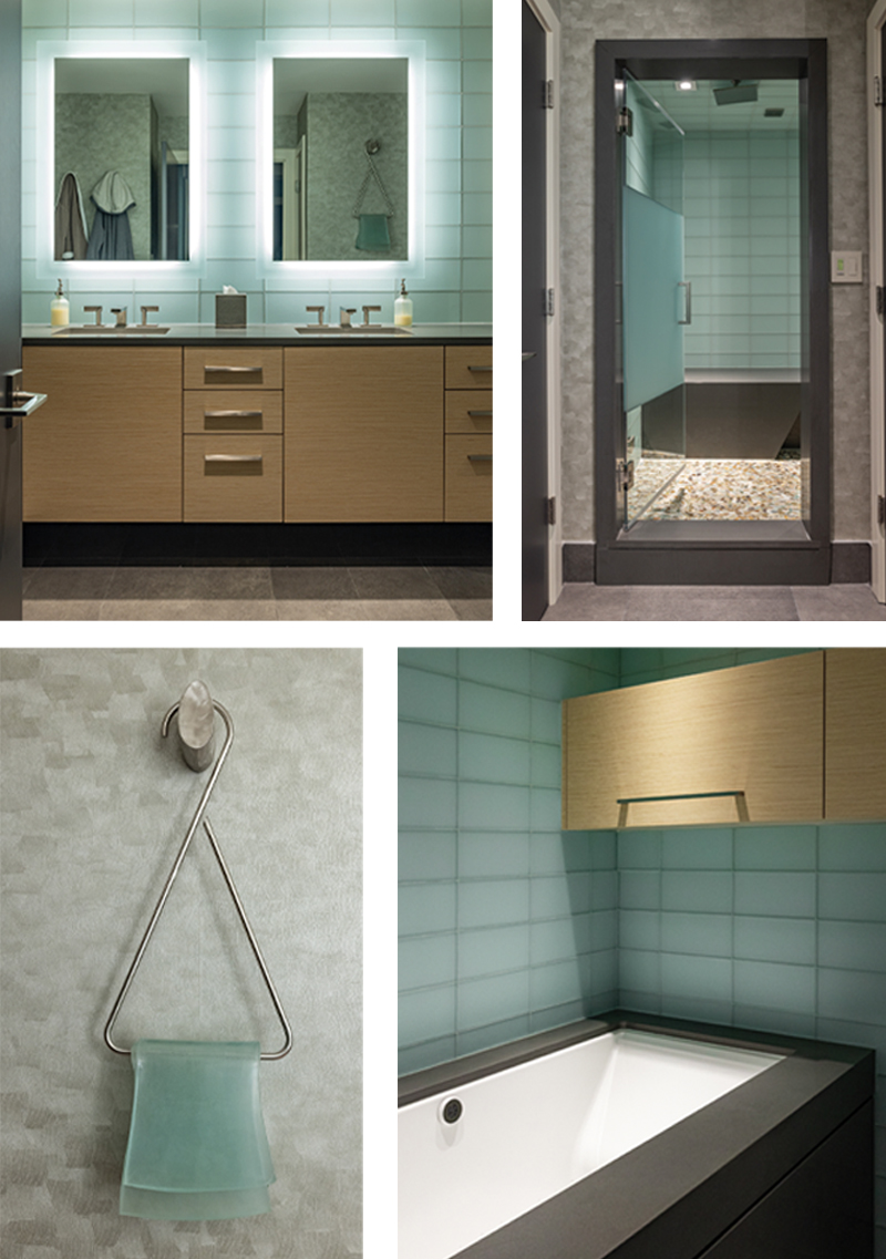
When Jenny Isenberg and her husband, John, bought the Plaza-area condo that had been in the extended family for years, it was a chance to downsize from their “modern folk art” style home. “But I didn’t want to be ‘apartment grandma,’” says Isenberg with a laugh. They stayed in their home and decided to use the condo as a staycation getaway, and eventually, as their senior living residence.
With an eye towards the couple’s changing needs as they age, Isenberg worked with Kurt Knapstein of Knapstein Design to create a soothing, simple, spa bathroom. Isenberg, who is a partner in Eclectics, the artists’ collective in Brookside, also wanted to leave room—but not too much room—for art. She found the trompe l’oeil glass towel and metal holder sculpture at the Plaza Art Fair years ago. The pale azure glass became a starting point for the design.
“I was not a wallpaper person,” Isenberg confesses, until Knapstein found the subdued wallpaper with brush stroke texture. He also sourced the backlit mirrors. “I didn’t want my fixtures to be the art,” she says. Working with the designer, she appreciated his attention to detail. “It was wonderful to have a partner,” she says.


