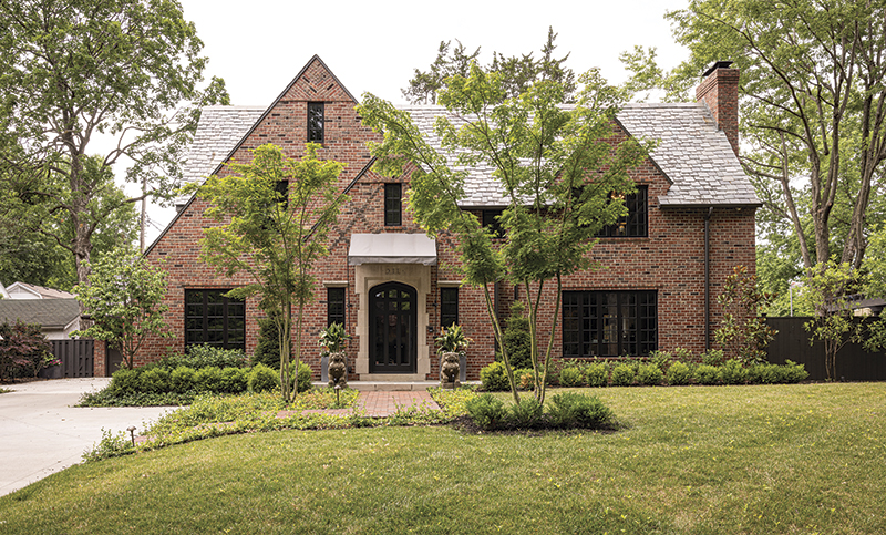
In 2017, Kurt Knapstein introduced his friends to his new home on a gracious street in Kansas City, Missouri. The classic Tudor had great lines and a generous lot, but it needed some care. “I’m only the fourth owner, and the house was deteriorating,” he says. “As soon as I closed on the sale, I hosted an open house for friends, clients, and neighbors. Immediately after that the house was gutted to the studs.”
Knapstein knew what he wanted, but he did not want to approach the project piecemeal. He hired John Wind, principal architect with Piper-Wind, for the renovation drawings. “John helped me implement my ideas.”
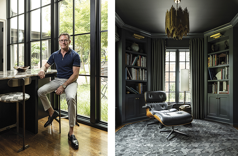
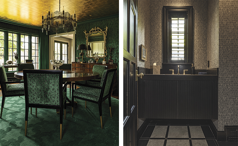
The concept in Knapstein’s head was “boutique London hotel,” with classic lines and materials, but a modern energy. The colors throughout have a traditional clubby feel—charcoal gray, rich taupe, sapphire blue, and malachite green accented with gleam of gilt—yet nothing is heavy.
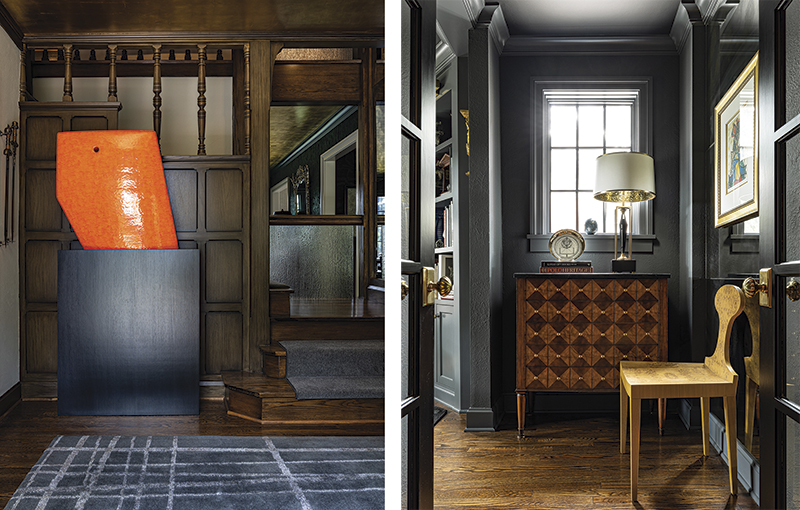
The entry retained the original stained-wood paneling, but a graphic not-quite-plaid rug and the James Marshall sculpture add a dash of contemporary flair. Knapstein mirrored the back wall to open the landing. The ceiling there and in the emerald Innovations silk fabric-clad dining room are gold leaf, which creates a flattering glow. “I had a gold-leaf ceiling in the entry of the last house,” he says. “I love the elegance of it and wanted to have it again.”
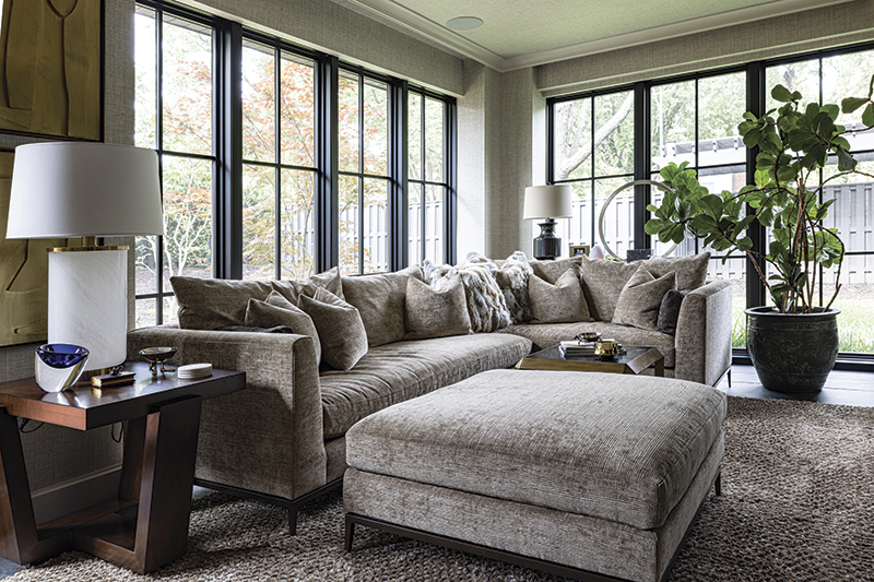
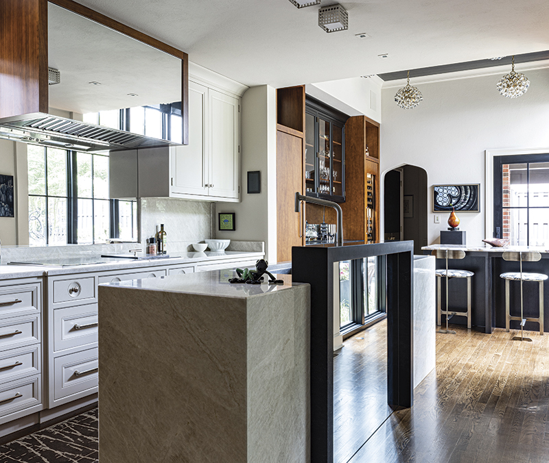
Still, Knapstein has a practical side. He capitalized on the ample light in the kitchen and used clean lines in his design for that room. It’s functional and fanciful at the same time. “If it’s just me eating at home, I can move a stool over to the eating space at the island and watch TV, which looks like a piece of art most of the time,” he says of the Samsung Frame television.
But when he entertains, which he very much enjoys, he has a quick and easy solution to accommodate a crowd. Stools are whisked to the garage, the table moves into position for a bartender to use as the front bar, and the island, which has an ice maker and both refrigerator and freezer drawers, becomes the back bar. “The first party at the house was a patrons party for the Symphony Ball in 2019,” Knapstein says. “I had 190 people here. Thank goodness there was incredible weather.”
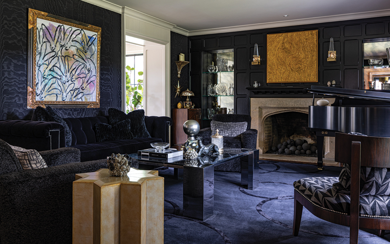
It was still a lively crowd in the deep-hued living room, for which Knapstein designed the graphic cobalt rug. The stone fireplace surround roots the room in its Tudor sensibility, while Hunt Slonem’s rabbits seem to be having their own party above the sofa. It’s a room that’s made for chic evening entertaining.
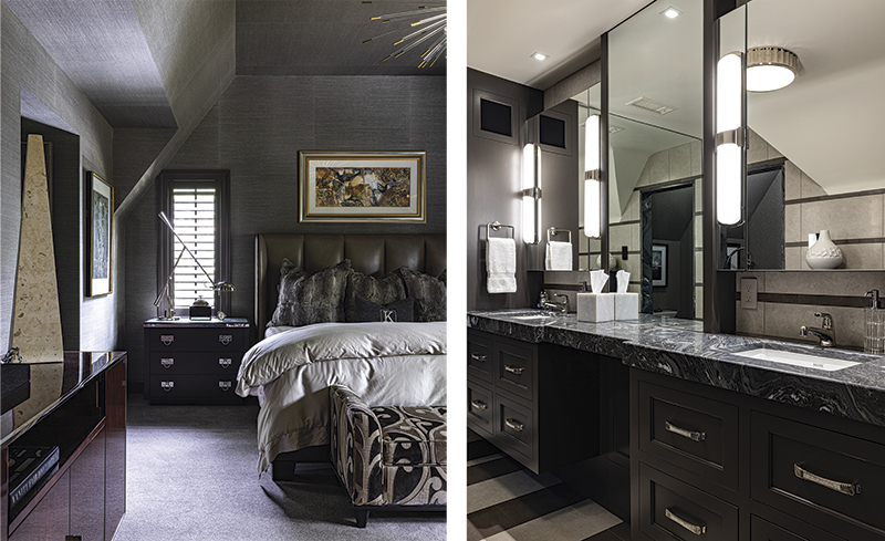
To counter the fast pace of his busy practice, Knapstein made the primary bedroom his haven. “The ceiling here was eight feet tall when I bought the house,” he says. “My previous home had a 12-foot-high barrel-vaulted ceiling, and so I knew I wanted more height.” He was able to vault the room with a ten-foot-tall tray ceiling that visually enlarges the space.
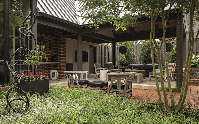
Knapstein wanted to take advantage of the commodious backyard—something that he hadn’t had at his last house in Sunset Hill—so he employed an abundance of glass along the back of the house to link the indoors and outdoors. The floor-to-ceiling windows in the sunroom on the back of the house visually double the inside space and provide the natural light that Tudors sometimes lack.
The covered patio became a popular spot to entertain friends on Sunday afternoons for Chiefs games. “I’m not really a sports fan, but it was a perfect space for having people over and being outside,” he says. The Tom Corbin sculpture centered in a grassy site in the backyard was the first piece he bought for the house. “I bought it during the renovation. I knew I wanted one of Tom’s pieces near the patio.”
The new landscaping at the front of the house is beginning to fill in, and Knapstein is patient with their progress. “It was an overgrown mess before, and I wanted it manicured and lush looking,” he says, then pauses. “The ornamental trees will someday be fantastic when they canopy over the driveway and front walk.”
The It List
Architect
Piper-Wind Architects
Art
Corbin Bronze
Interior Design
Knapstein Design


