When KCAI grad Aimée Brodbeck (Graphic Design ’08) scored the chance to create the design for Joe Biden’s presidential campaign, she ran with it. Brodbeck’s motif of the instantly recognizable patriotic red, white, and blue logo has been splashed across everything from yard signs to emails to GIFs. (The brand was used by the campaign from April 2019 until Kamala Harris joined the ticket in September.)

We caught up with Brodbeck to find out more about how she volunteered her time and talents to help Biden’s team ultimately find success.
Biden’s logo is instantly iconic. Tell me a bit about the design process and how your work initially came to fruition?
I treated the Presidential logo the same way I treat any client. There needs to be a purpose for design. My first step to my creative process is always the simple question: why. Why is this entity unique? Why is it worthy of time and attention? Why should the world create a space for it?
Through these questions, there came a strategy. Biden entered the competitive landscape with age, baggage, and wisdom. He stood out, though, with his familiar empathy and mission to unite the country.

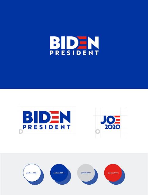
His mission to unite the country became the key to this design. The process started with hundreds of sketches that tried to communicate “unite”. What a coincidence that our nation, The United States of America, is founded on that word, and it already has an identity. I took inspiration from the American Flag to create a logo that “united.” The three stripes are a representation of the American Flag, but they are also a call back to the three stripes in Sol Sender’s Obama “O” logo.
Then there’s the most important choice—typeface. I always knew I wanted to use a humanist sans serif font with an approachable personality— something that reflected Biden. Brother1816 by TypoType was instantly a top contender for its quirky personality, legibility and sharp-ended strokes.

I’ve heard you refer to the logo as “approachable” and “strong”—what else does it evoke for you personally? And for Biden fans?
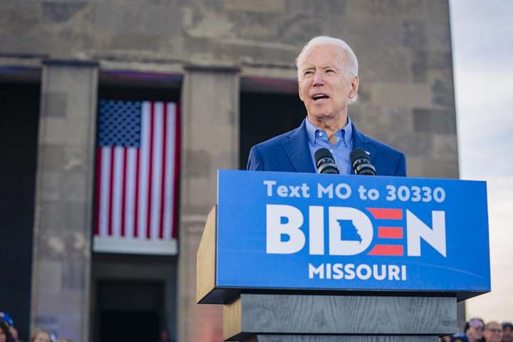
I’ve heard this from past design mentors, and I believe it to be true: the best logos are the simplest. While this logo was not loved by the press for its simplicity at first, the public’s admiration grew over the next year and took on its own cultural form. (My favorite part of this process has been seeing fans take the logo and making it their own, from various things like VIBEN sweatshirts & Settle For Biden Vans.)
To me, this logo represents the power and purpose of simplicity. Joe’s approach and personality has always been simple. I think this logo not only reflects his mission to unite, but also his personality.

How many versions did you go through before the final product? Was it a constant work in progress?
Welp, let’s just say it was a very, very intense sprint. We had two months to develop a look and feel including an identity system, merch, wallscapes, posters, social, billboards—you name it, we did it.
We presented five times to the Biden campaign, each one with detailed concepts. One meeting was simply all about color theory. What color should we use: the colors of the American flag that are digital friendly or the true colors on the American Flag that flies in the white house? Everything had a purpose.
Tell me a bit about your time at KCAI and how that shaped your artistic flair.
The Kansas City Art Institute has helped me in a lot of ways starting freshman year. I went through Foundation, which helps students start to stretch creative muscles in all mediums. I entered the program as a future illustrator and I left college with a design degree. I am incredibly grateful for teachers like Brett Reif, Brockett Horne, Tyler Galloway, and Paul Diamond, who pushed me to find purpose in my creativity. It helped create a drive in me to do social-impact work and use my talents to better the world.
Your handiwork is everywhere. Literally. How does that feel?
Surreal? I think that’s the best word. As a creative, when you make things and put them out into the world, you hope that the art makes a difference. You hope that it matters to someone. In the back of your mind, you always know that there are risks associated with taking a little piece of you that you created and sharing it. It could go unseen. It could end up on the cutting-room floor. It could be scrutinized, hated, torched and raked across coals.
And then, just like that, you are onto the next project.
This process has taught me to take pause and celebrate. I think creatives often don’t celebrate their own work because art can be an emotional release. Often, once we finish a piece, we roll up our sleeves and move onto the next without even really experiencing the impact that we have in culture. I’m so grateful for this opportunity to create something that mattered to this nation and it’s worth taking the time to look around and be proud.

Years from now, what do you want people to remember about this logo?
I’d like people to remember that this logo was made out of hope. It wasn’t made by a large design firm with hundreds of hours to stare at the wall and critique, pixel push, and test. This process was created by a handful of people who worked after business hours to donate free time and free talent because they believed in something greater than them.
(I’d also like to give credit to Mekanism Volunteers: Tom Lyons, Jason Harris, Ambika Pai, and David Horowitz. These talented people gave a huge part of themselves to the Biden Campaign and this process.)


